SaaS Portal
I was placed in charge of product design for a concept Software-as-a-Service (SaaS) portal to be created by the UX team. The request from our stakeholders was a brochure site that represented our thought leadership in the field and could also be used to sell SaaS applications. These applications could be purchased by a state agency and “go live” immediately. With a rush for time, we conceptualized and designed 14 pages in two weeks. While we did not get to all the testing and iterations we wanted to, we laid a foundation for future research and iteration for when the product would go live.
A main requirement of the offering was to include white-papers, videos and general thought leadership on the industry. These needed to be findable through search engines and relate directly to our product offerings. There also needed to be flexibility in modifying the product offering to include additional services at the time of purchase.
Our stakeholders provided an initial user flow and what their expectations were for the final product. Some thought it should be a simple site with a basic prompt (see below). Others wanted more emphasis on White-Papers and Thought Leadership. In the end we were able to make both camps happy and provide —what we hope is— a fresh take from our competitors.
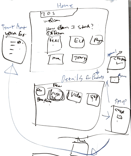
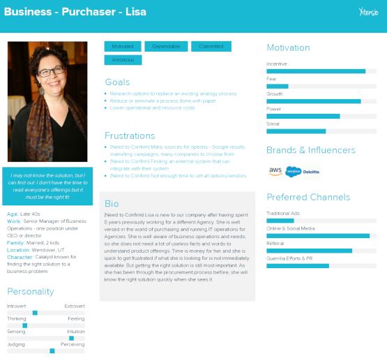
White boarding from Kick-off Meeting
In an ideal setting the UX team would have been engaged earlier in the discovery phase of the project. One of the tools that would help in this situation would be to perform User Interviews or Surveys to determine the process our customers go through when procuring a new application. Then we can create hypothesizes on how they might use our product to solve their needs and what possible Value Propositions we can offer them that our competitors might not have covered. With this research we can determine Key Performance Indicators to use for testing, then preliminary User Tests that would gain us metrics into how well our ideas are matching the user’s needs. I am a big fan of the Lean UX method and Jeff Gothelf has created a neat Lean UX Canvas which incorporates a lot of this initial research into an easy-to-read format. Armed with this research, we would begin to create an Omnichannel Experience Map to conceptualize how this app would fit into our product portfolio or determine the User’s Journey of what led them to us. Then create preliminary User Stories for how they might use this app.
Highlights
- Complete UX Cycle
- Role blend of Product Designer / User Experience / User Interface / User Research / Interaction Design
- High Output in Limited Time
Moodboard
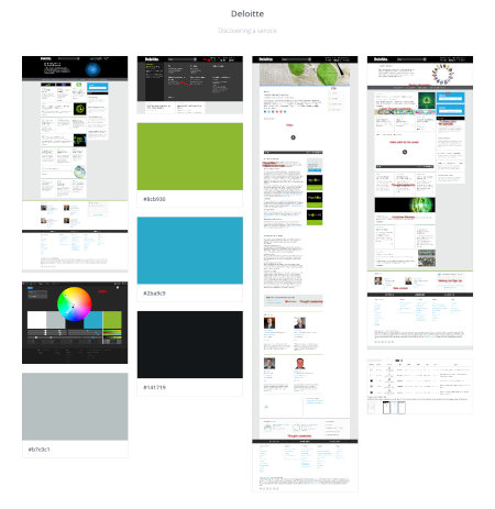
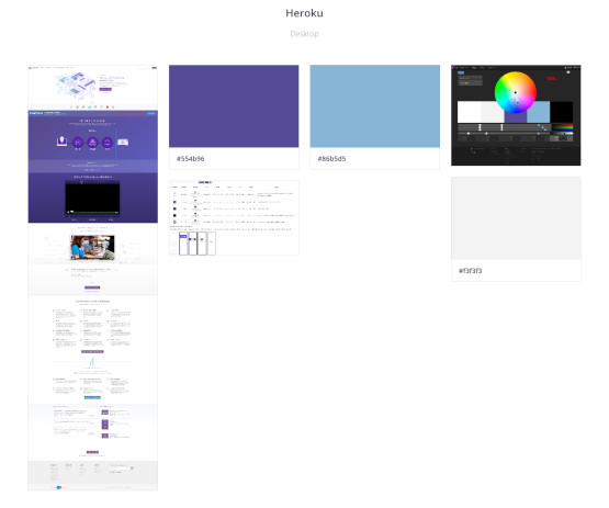
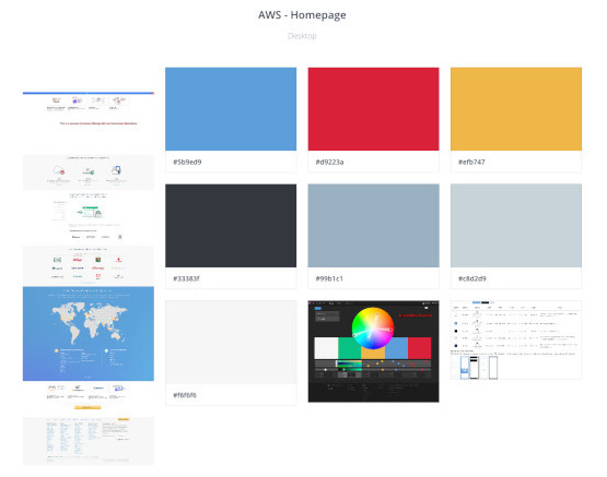
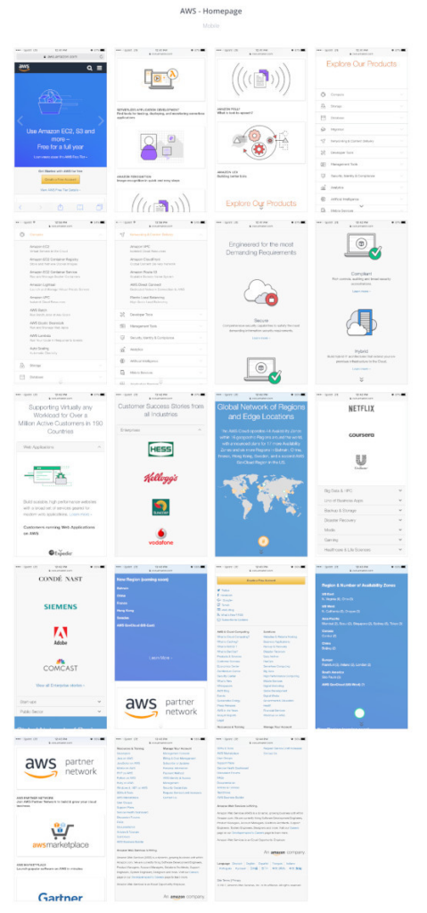
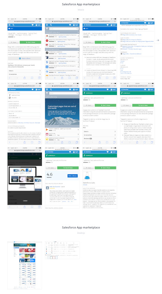
With time being a factor, I set out to make the Branding compliment what had been done before instead of completely re-inventing the wheel. This turned into keeping the colors, the main image and Title font consistent but the direct implementation flexible. Since this was our first SaaS portal offering, we needed to figure out how other companies sold SaaS. We determined the top 3 direct (Salesforce, Amazon, Deloitte) and indirect (Heroku) competitors and researched how their sites are constructed. We generated a mood-board in InVision with screenshots, brand colors and their color harmonies from the competitor sites we researched to provide inspiration and a point of reference. This mood-board provided us with a visual guide to break down the designs for the competitor analysis.
With more time, we could have also chosen additional competitors whose brands were closer to our “fun and hip” branding. We could have also expanded the mood-board to be more rounded with outside ideas/concepts that you would find in a traditional mood-board, instead of just a competitor mood-board.
Competitive Analysis
With the mood board in place, we created a spreadsheet with analysis of the current industry leaders to get a better sense of how SaaS products are sold. We focused on our riskiest unknowns about the design (colors, branding, layout) and how the point-of-sale is made (where/when/how). Overall we looked at 46 different metrics based on the needs from our requirements gathering.
In most sites we found the Product catalog to be the main focus of the page and above the fold. Most companies did not offer services, but if they did they were listed just as products. Color accents or moving carousels were used to grab the visitor’s attention. Most sites have a light colored background with black body text and use color accents for CTAs, Products, Highlights, etc.
Brand authority is instilled through high fidelity pictures or custom vector art but rarely are both used on the same site. The imagery is usually drawings of computer science or e-commerce/business related. Iconography is mainly for Products/Services and Section Headings. The majority of sites use pictures or drawings on less than 30% of their site but still average around 17 instances. Most included stories about their customer’s success with their products through the use of direct quotes and represented them with the branding from their largest customers.
The majority have a color-palette of 2 colors (in addition to Black/White/Gray), primarily of analogous blue and green. This could be because recent studies have shown men and women both prefer green and blue (in addition to purple, the next most common color in the survey). And color psychology suggests these cool colors would give a “calming” and “freshness” to the design. The Call-to-Action buttons are usually blue, which might be to calm any purchase anxiety. Bold color contrasts were not used for design (no high-contrast/extreme colors/backgrounds/images). Infographics and Charts/Diagrams were not frequently used. Rarely did they include any Social Media postings or trending topics.
The point-of-sale itself was not actually performed through the site, instead interested buyers are encouraged to contact the sales team directly to begin the procurement process.
I would have liked to spend more time breaking down the mechanics of the different sites we reviewed. Our research could have benefited from a more formalized analysis of the content, particularly on the types of subject but also the writing style and how closely it relates to the product offerings. We could have also looked at the various design patterns by making templates of them and considering what their intended goal was to better inform our design. With time being a factor, we had to focus on what had been asked of us.
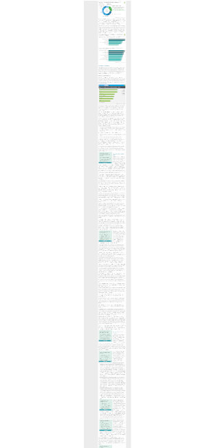
Personas
We knew two users that we needed to focus on were the purchaser and the implementer of the purchase.
With only enough time to perform one, we focused on the purchaser as our main customer and created a Persona for her with Xtensio. Meet Lisa, the procurer of applications at a state agency.
Persona – Business – Purchaser
Lisa is based on previous experiences dealing directly with an agency. This is probably 80% accurate but would still need to be proven with analytics and further research.
Lisa is a motivated, dependable worker who is committed to the success of her department. She’s ambitious in showing her value because she has a family of four and hopes to eventually transition into a role which allows her more time. She likes data points that she can place on a powerpoint to show immediate value to her superiors. She likes to understand the value of each product and will look outside the box for solutions with the most value. While she enjoys having data, she knows when someone is “trying to make a sale” and doesn’t like to waste time on graphs and figures. She does not like vague fine print because she wants to know exactly what is being purchased.
One of her goals is researching replacements for analog systems and processes that reduce manual paper processes and lower operational costs. She is very familiar with existing processes and knows what is successful for her department. She prefers direct recommendations from colleagues of proven solutions that work for other departments and agencies. While she is completely comfortable researching solutions on Google, she does not like to because of the uncertainty of many unproven choices.
This user will probably value having useful features and success stories shown first to see if the site is worth reading. If the initial offerings are ones that provide the most value to this user, we should see them actively engage with the site. There should also be cost/saving information available to be presented to superiors.
This is another phase where spending more time exploring who the users are would bring greater insights. Ideally there would be more research to back up the hypothesizes in this persona. I also would have liked to create more Personas, at least for the top ten users. The best way of gathering this would be to use real-world analytics from existing products or user interviews/surveys. I also would have liked to create a User Journey for how she would use this app.
User Flow
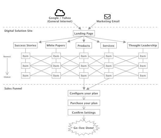
Our Product Owner already had a general flow in mind for our established user. When it became time for procurement of a new solution for an existing process, our main user group would google for software development of a state agency and locate our SaaS portal. We got together and sketched out the main user flow.
The steps we determined are:
- The user starts by googling for “State Government Licenses and Permits applications”
- They locate us and visit our landing page
- They read more about us and our partnerships
- They search through our offerings
- They locate a product that suited their needs
- They read about the product
- They configure the options for their offering
- Then purchase the offering with it going live immediately
Brainstorming session of user-flow
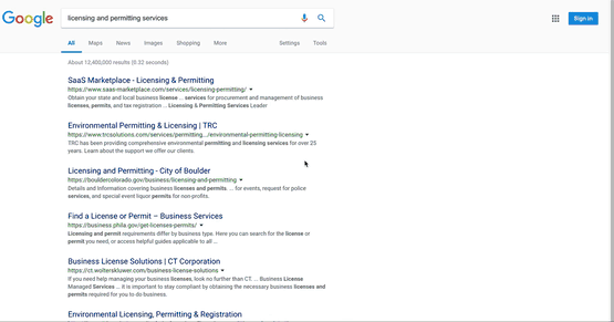
While this approach is sound, with the vastness of the internet and the deluge of entries on Google, I had some misgivings about whether our main source of leads would be from Google Search results. After a discussion with our product and project management office, we had an idea of how our users would locate our products. The users would already have an account created for them by their SAM and would receive monthly marketing emails to remind them of our product offerings. When it came time to procure a new application, the user would remember our offerings, click a link in the email and be taken to our product portfolio. By fine-tuning our SEO, our white papers and product offerings would appear near the top of Google Search results to attract unregistered users. Once on the site, related information to our Products and Services –such as white papers— would instill brand authority and confidence in our offerings. At the point of purchase, a user would be able to add additional products and services to cover all of their business needs. Then a user would be able to purchase and deploy these products to go live immediately.
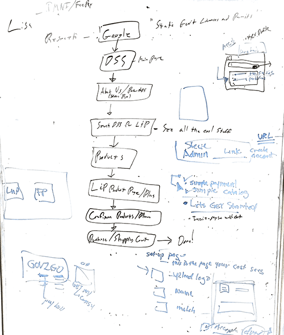
We brainstormed more of these concepts and the user-flow through the app would look like this:
User Screenflow
Ideally, I would have liked to test this initial theory with user interviews then a task analysis to determine the priority of each entry point. Internally we would brainstorm various ways we could attract the users and create initial user/omnichannel journey maps for our top ten personas. Additional user surveys would confirm the level of interest these channels have with our actual users. At the least, I would have liked to create storyboards for our top three main approaches for our main users. Then create wireframes for the mobile and web approaches of these omnichannel experiences (or storyboards) that include the users possible needs during each phase of their journey. With these early prototypes, we would sit with our end-users and walk them through these wireframes to hear their direct feedback. This would be to check if we missed anything or something felt weird. Unfortunately we were pressed for time and had to use our best-guess as to what our users would need in wireframes.
Wireframes
One of our primary concerns for the site was how the presentation would instill the authority of the brand. Based on our competitor research, we knew that how we used color would play a key part. Most of our competitors used a white background with splashes of color and pictures or vector art. With a limited budget and time, pictures and vector art were out. This turned our focus to how we utilized layout and color. With the advances in design patterns over the last 5 years, we knew there was some flexibility in how we framed the site’s focus on thought leadership. So we started brainstorming different design patterns to present information in an “authoritative way”.
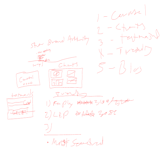
Brainstorming Design Patterns for Brand-Authority
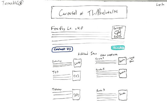
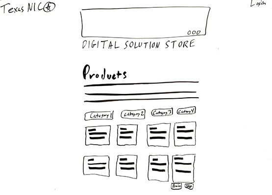
Then we started brainstorming all the elements that would need to be on the details page for a product.
Brainstorming session of the details page for a product
Draft v.1
With time being a critical factor for this project, I wanted to iterate just enough to get a rough full concept of the site in order for the shortest feedback loop. Not ideal, but good enough for the constraint.
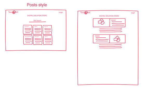
I started off by focusing on our intended main focus which was thought leadership. One design pattern was to show them as cards which allowed for more headline content within a smaller space while still giving insight into what the article focused on. Another was to show them with a blurb and graphic as a way to be more eye-catching but still content-rich. I used InVision Freehand to sketch out some ideas.
Whiteboarding for arranging thought leadership
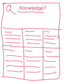
Finding exactly what you’re looking for just by titles is often very frustrating due to the limited screen space, so a site-wide search became necessary. Wanting to keep the “fun” branding we had used previously, I considered a simple one-word placeholder. I played around with showcasing the most popular articles and search results on the same page, keeping all the elements contained within their own component.
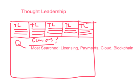
Thought Leadership Horizontally With A Search Bar
Thought Leadership Arranged Vertically with Products and Services Added As A Horizontal Scroll
Thought leadership arranged vertically
These design patterns seemed like a good place to start to get initial feedback, wanting to not waste time and to shorten the feedback loop, I moved on to the next most important element; brand authority.
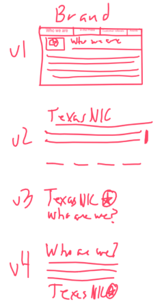
I started considering how to showcase the branding on the landing page. I tried some of the more common design patterns; a header on top, the logo and some text, a logo with just a link, a blurb with a logo. While any of these would have worked, the main focus of the page needed to be the main content (Products, Services, White papers), so the branding needed to be secondary but still eye-catching.
Various Ways To Show Branding
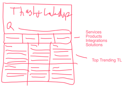
When reviewing with the product owner, we determined that the lack of additional products and services changed the main concept of the site to an Informational site (a la Wikipedia) instead of a brochure site. So I kept on iterating. Ultimately, the Product Owner wanted something more eye-catching and to include more about the product offerings up front. This led to concentrating on a landing page with all the site content equally placed. There was also a request for a carousel similar to our competitors.
Knowing that we needed to offer a lot upfront, I create a quick iteration of how these elements might work together on the page. I placed the carousel as a banner ad at the top of the page, followed by our brand representation. Then a smaller version of the Thought Leadership component I had previously white boarded with the latest trending Products and Services below it. Then, in case none of the above was what the user was looking for, a site search.
Possible Page Layout With All The Components
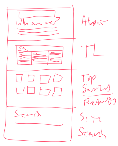
A More Detailed Drawing Of A Possible Page Layout
The Product Owners liked this direction and asked to iterate on it further.
Ideally, I would have created some wireframes of each of these concepts as individual single-page wireframes and tested them to check the feel of the flow as a whole. Then locate whatever users I could find –even if that simply meant asking another co-worker who wasn’t familiar with the product– to test the concept with them. I would have tested our hypothesizes: what stood out in the design; how they would find information on the page; whether they would be motivated to buy a Product just from visiting; etc. This shortened feedback loop would confirm if we were headed in the right direction.
Draft v.2
From the competitor research, carousels were a common design pattern and helped with brand authority. To draw attention to our latest offerings, I created a carousel at the top to grab attention and repeated it on every page. With the thought leadership being the main entrance to the sales funnel, I brought it front and center. I also added another carousel to draw attention to it. I sketched these ideas on a physical whiteboard.
Here the main focus –because it’s above the fold– is on the products/services/articles that are most popular or that we are trying to direct traffic to in the carousel. Followed by our top Products and Services.
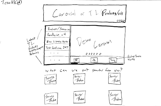
Landing page with focus on Thought Leadership
When a visitor is reading a blog post, related Products, Services and Thought Leadership would also be browsable.
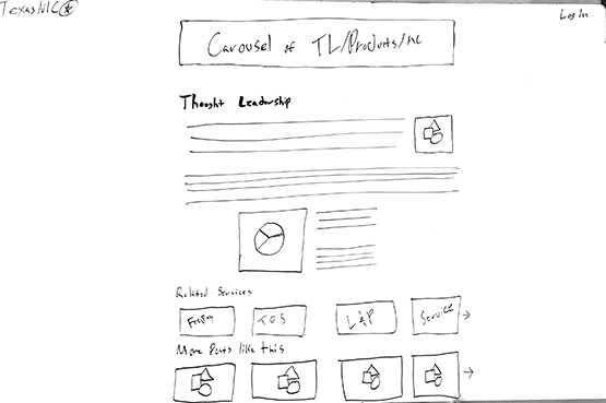
Thought Leadership page with Pictures and text – related Products/Services also shown
Having the related Services and White papers sections scrollable is a solid design pattern for mobile, it becomes problematic for Desktop browsers. This was refactored in the mock-ups as a “See More” link.
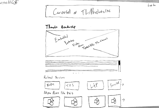
Thought Leadership Page – same as above but with video
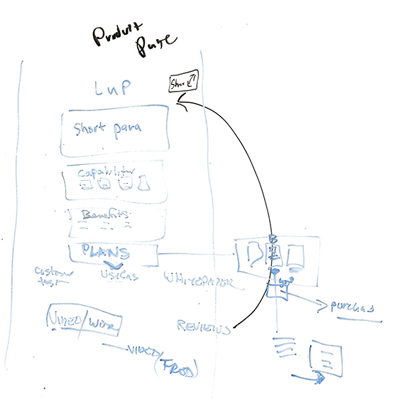
Point of Sale Funnel
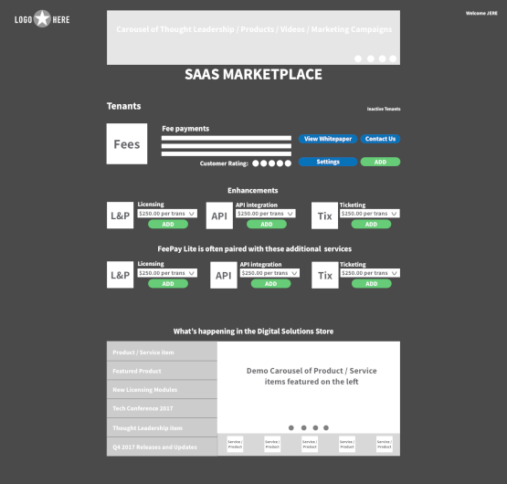
When a visitor browses the details of a Service or Product, they will see additional Products and Services they can add as components to their purchase. They can also contact their Strategic Account Manager directly from the page if they have any questions.
Inspecting a Service – Be able to immediately see additional products and services for initial offering
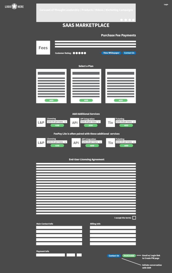
While setting up a plan, Products or Services would be dynamically added at the point of sale with the EULA changing accordingly. The main related white paper would also be viewable. In an attempt to reduce user confusion, I reversed the design pattern from the details page. There are also two contact buttons (at the top and bottom of the page) in case the user had questions before purchasing their plan. The purchasing of the plan would take place on a 3rd party payment portal.
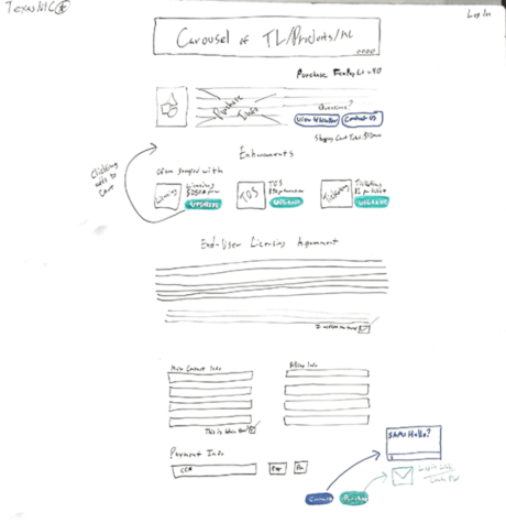
Purchasing a Plan – Being able to make an immediate purchase of a product
Once the user had purchased a plan they would be taken to the main user space. Here they could finalize any additional settings or add additional products/services for their web application before making it live. I also included the thought leadership and product/services components from the main page to increase opportunities for additional sales.
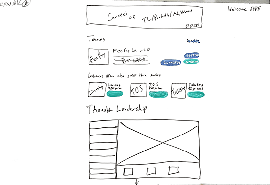
User’s home-page / Application manifest – Example of what the user would see logging in to setup their service.
Once the user had purchased a plan they would be taken to the main user space. Here they could finalize any additional settings or add additional products/services for their web application before making it live. I also included the Thought Leadership and Product/Services components from the main page to increase opportunities for additional sales.
Mockups
Lo-Res Mock-ups
With the second draft of the sketches complete and sign off from the Product Management team, I created some low fidelity Mock-ups in Sketch.
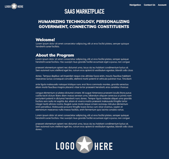
Because we had iterated through enough drafts with the Product Owners and Design team, there was very little confusion on what the final product would look like. The biggest change was the use of a dark background. This was done to separate our offering from our competitors who were using white backgrounds. A common design trend (in 2017) is to use more color, I felt that a white background with dark text gives the page a very 90s/Craigslist feel.
To save time on trying to figure out iconography or design interesting vector art, I chose to mimic Adobe’s design pattern of abbreviating main titles.
If this was to go to production, I would advocate for investing more time in choosing the right icons/vector art or creating custom ones. This would depend on customer feedback to determine which design would be the most enticing.
On the landing page the Product Management team liked this approach, but decided that having the thought leadership front and center gave it too much emphasis. This page was refactored (see next section below) to appear more as a general landing page.
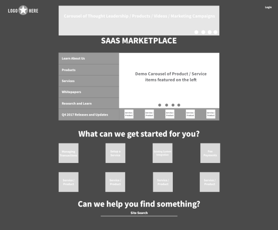
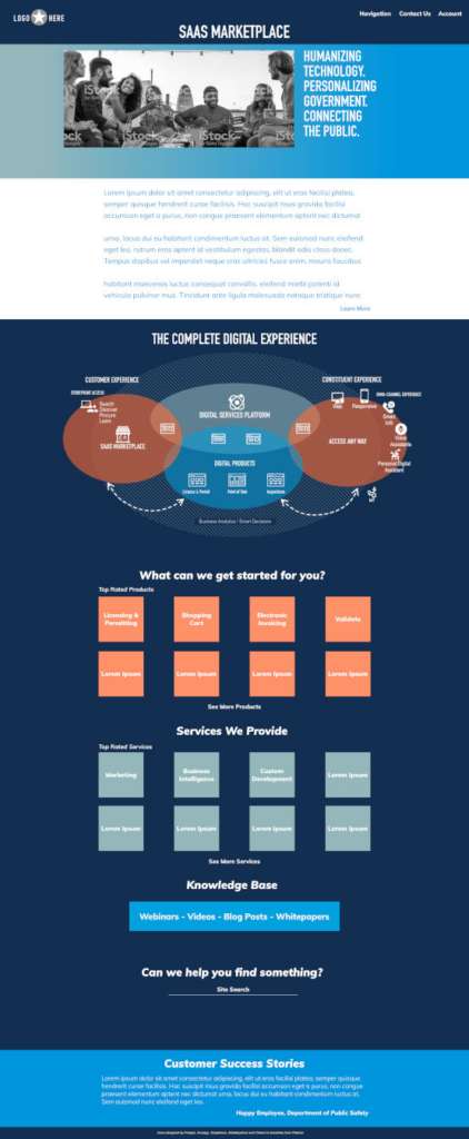
Landing page
Product Details page
Thought Leadership – blog entry with charts
Thought Leadership – w/ Youtube Video
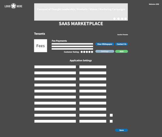
User Account – Application Settings
User Account Homepage
Product page – Viewing and Configuring a Plan
I would have loved to make a few variations of this concept, trying different styles of backgrounds and design patterns for presenting this information. Then have the design team chose the best variations to then be tested with our main user groups for a shorter feedback loop.
Draft v.3
The feedback from the Product Owners was positive overall, but they wanted the Products and Services to stand out more on the front page and sit equally with the Thought Leadership. I worked on placing these cleanly on the main page, giving each element equal weight. It was also requested to bring back the site-wide search functionality.
Homepage – working on including all of the requirements equally on a page
In this variation I attempted to add more flexibility in how the site is navigated. I included Topical navigation in the Thought Leadership section and added a Search for products.
Homepage
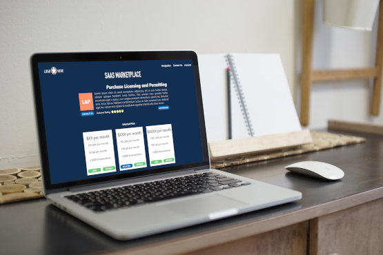
Products Marketplace / browsing – Example of browsing Products with new layout (see additional products and services that could be added)
With time being a factor, we decided to move into a more traditional landing page approach that showed all the information equally. It was determined a site-wide search would handle the functionality of the individual search options. With buy-in on the overall design, I added more fidelity to the Sketch assets.
High-Res Mock-ups
Our Product Management determined that a Carousel would be too distracting which led to refactoring that out of the design. There was also a desire to include customer success stories on the main page, this was factored in.
I chose a dark blue background that we like to use for our state clients which made the bright colors from our branding really pop. Which also contrasted what most of our competitors were doing. Our Marketing Department prefers to have minimalist design with subtle use of color, so coloring was kept to a minimum. At this stage, Product Management determined that a Carousel would be too distracting so it was refactored out of the design. There was also a desire to include customer success stories on the main page which were factored in.
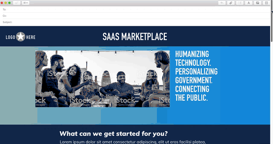
When the design went from concept to product, the landing page felt like it was missing some “pop”, was a little off-brand and did not have that “landing-page” feel. I referenced our source material (branding and third party site) and decided something that might help would be to include an image. I used a stock image and the font-styling from the third party site, which helped the page feel like a landing page, but it was still missing something. A design pattern our competitors used that was popular in 2017 was the use of gradients. Using this with a white background added the “landing page” feel to the page. In lieu of custom designed vector art, I inserted an infographic that I had previously created. For typography, I kept the main brand font for the headings and experimented with pairing the body font. To contrast our competitors choices (PT Sans, Open Sans, Benton Sans, Arial), I chose a Modern Humanist font that felt like it fit the style (Apple Gothic). Unfortunately, this would need to be refactored to something non-proprietary for production (PT Sans would be closest).
With this version, I focused more on the balance between the folds to make sure everything worked together and as separate screens.
Landing page
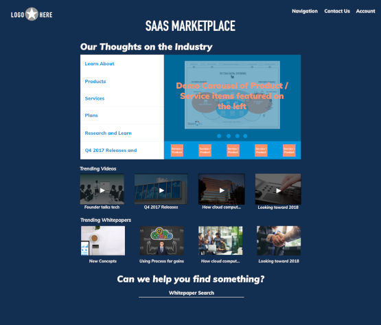
Thought Leadership portal
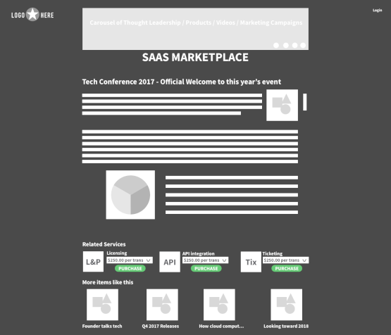
Thought Leadership – blog entry with charts

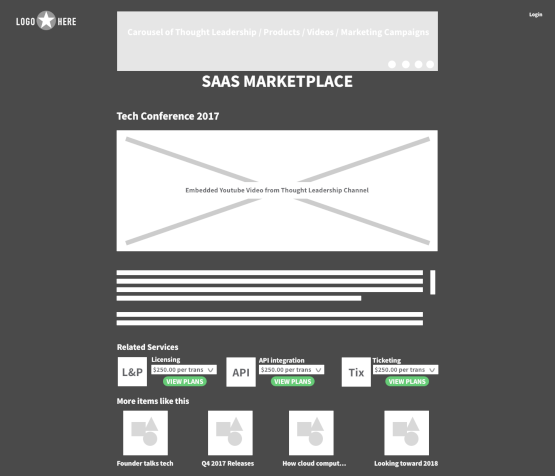
Thought Leadership – w/ YouTube Video
About Us page
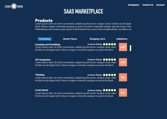
Browsing Products
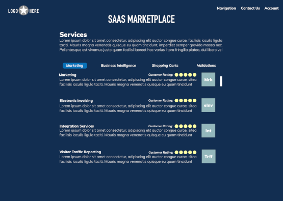
Browsing Services
With the Product details page being the main point of entry for the sales funnel, additional copy content would add more clarification and increase purchaser confidence. Now the user would see a graphical representation of the capabilities, a list of the various benefits that service would bring, customer testimonials/user-cases, related thought leadership and additional services that could be added to enhance the offering. To keep consistency, I reused the styling from other pages.
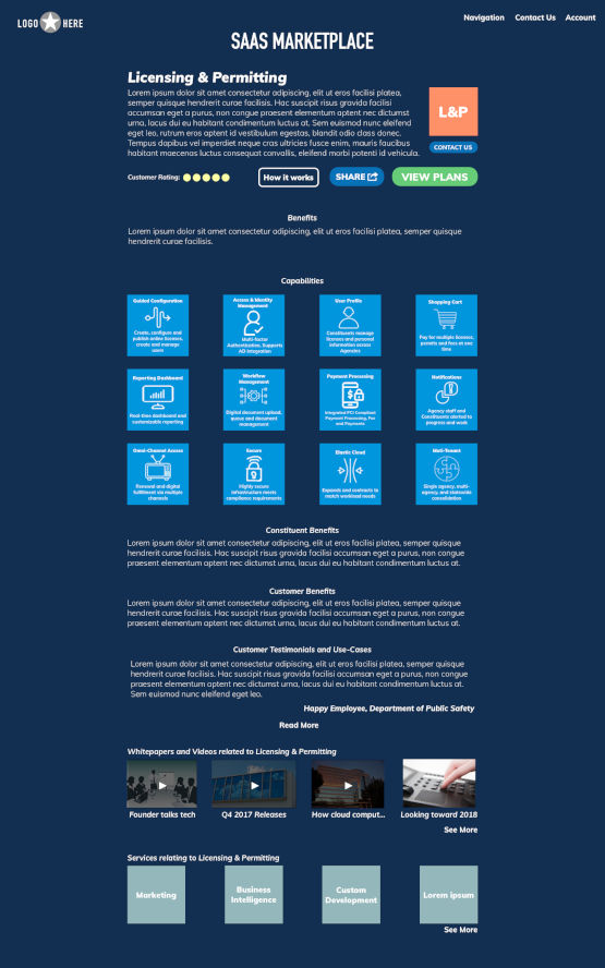
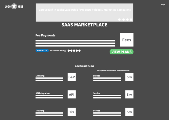
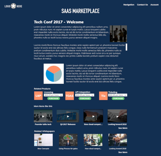
Product page – details for a Product
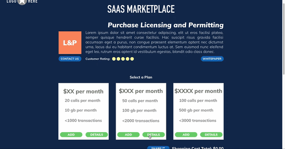
Most of our competitors used blue for their Call-to-Action buttons. With the background being blue, this would not have created a good contrast to draw the visitor’s attention. I chose to use green because it is also an inviting color and would compliment our existing branding color palette. I chose a fresh “Spring” like green to get attention but still be inviting. The other blue CTA is a brighter version of the same hue as the background. At this point, the end-user has chosen to view the available plans for the product.
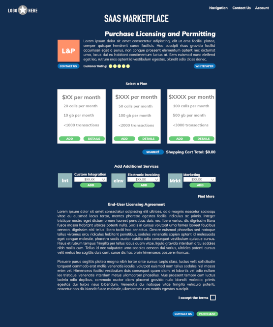
Product Page – Selecting a plan
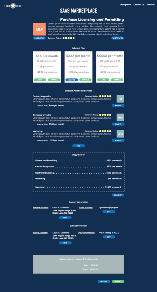
This is the confirmation page after going throw the payment portal. The user has added additional services to the product offering and checking out.
Product Page – Confirm Plan Purchase
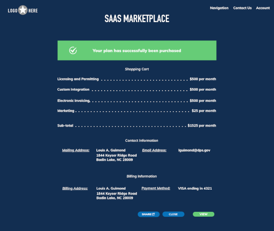
The user would then arrive at a receipt page which they could then directly view their live application.
Purchase – Receipt
When the user chooses to view their application, they arrive at the User Account Homepage. Here, they can configure different options and choose to deploy/undeploy applications and services.
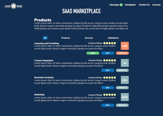
User Account Homepage
Product Management liked the end result, so I moved forward with creating a prototype with InVision.
Ideally creating more iterations of this site concept with different design patterns and styles of backgrounds for presenting this information would bring more of the design flaws to the surface Then the design team could chose the best variations to be tested with our main user groups for a shorter feedback loop. One of the hypothesizes I would want to check would be if users want to share this information via social media.
Sitemaps
This illustration explains what a site-map would look like for the final product. A best practice in Information Architecture is to have everything be connected to allow easier access to the content. It is best practice that every page (vertical lanes) should link to every type of section (horizontal lanes) and ultimately funnel into the point of sale.
Sitemap
Prototypes
This is the proposed main user flow from receiving an email to them directly purchasing a product. The hypothesis is that the user is already familiar with our brand, white papers on the subject and just looking for a specific product to purchase.
Video for Main Flow – Straight into Product
This is the proposed main user flow for a user who knows nothing about the brand and discovers the site on Google. The hypothesis is that they would research more about us and our product offerings before ultimately purchasing a product. This video shows them browsing the site, learning about our brand and then purchasing a product. When the prototype was wired up in InVision it became obvious that a more traditional navigation would benefit the experience of navigating the site. To stay minimalistic, I added a single entry for a drop-down menu in the header (“Navigation”).
Video for Main Flow – Google to Main page
There was also a need to be able to share information about our offerings, so I added a modal with the most common options.
Video of Share Modal
With the prototype now wired up, we can test our main hypothesizes and assumptions with actual users. We could also use a third party testing company like usertesting.com. Since we did not build the user tests beforehand, this would be the time to generate several test cases based on our business goals and KPIs. Normally I like to generate the user tests when gathering requirements (or creating omnichannel maps/storyboards) to ensure that we build those paths first and/or give them more time/consideration. Ideally, we would have already been testing and iterating our designs throughout this process so at this phase we would have a high degree of confidence that our offering would fit our user’s needs. Without that empirical data, it is hard to measure how successful a user would be in making the type of purchase that they needed.
The Product Management team liked the outcome for the project, they felt it gave our portfolio a fresh take on a SaaS portal. They really liked how we used calming colors with accents from our branding. With an MVP now completed, we could build out an application with basic functionality to test our hypothesizes for user feedback.