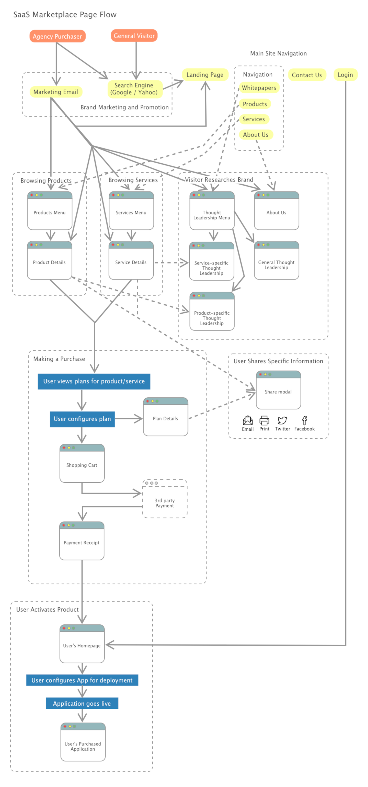
I was tasked with the role of Product Designer to create a Proof of Concept for an application to be developed when resources became available. Our problem was “How do we create a marketplace of apps that can also go-live immediately after purchase?” Normally we custom-built applications from scratch for each deployment. My hypothesis was that end-users could assess options and setup the app before deploying it without our assistance. This was a challenge as most users did not know what they wanted at the time of purchase and usually had our direct assistance during construction.
Another problem was we needed to present our thought-leadership in the industry for brand integrity. My hypothesis was we could present white papers and videos alongside our apps to showcase our industry leadership.
I worked directly with a Product Owner as the Product Designer and would have been the UX Lead when the project went live. We collaborated on the design concept and I led the workshops to create the design deliverables. I also created all the final visuals / screens / user experience. The main goal I was tasked with was to create something similar to our competitors, so I focused on Competitor Analysis and functionality. We already had a branding guide used for marketing material and a layout concept from previous applications.
Design Explorations
Process & Approach
Research and Analysis
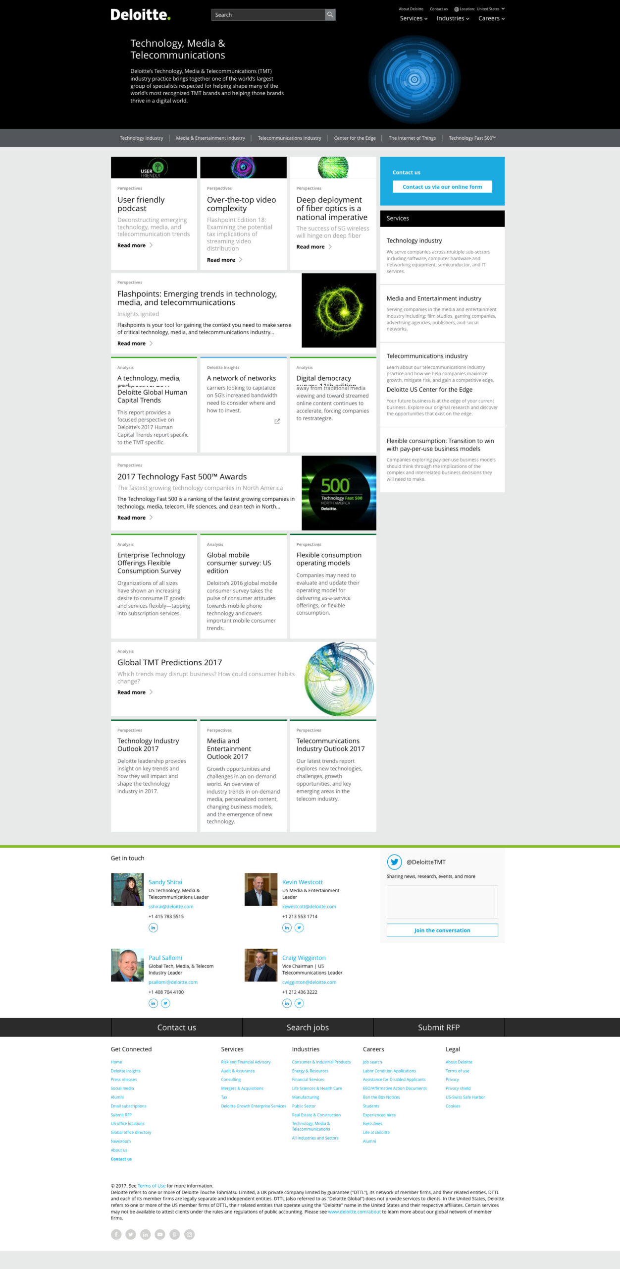
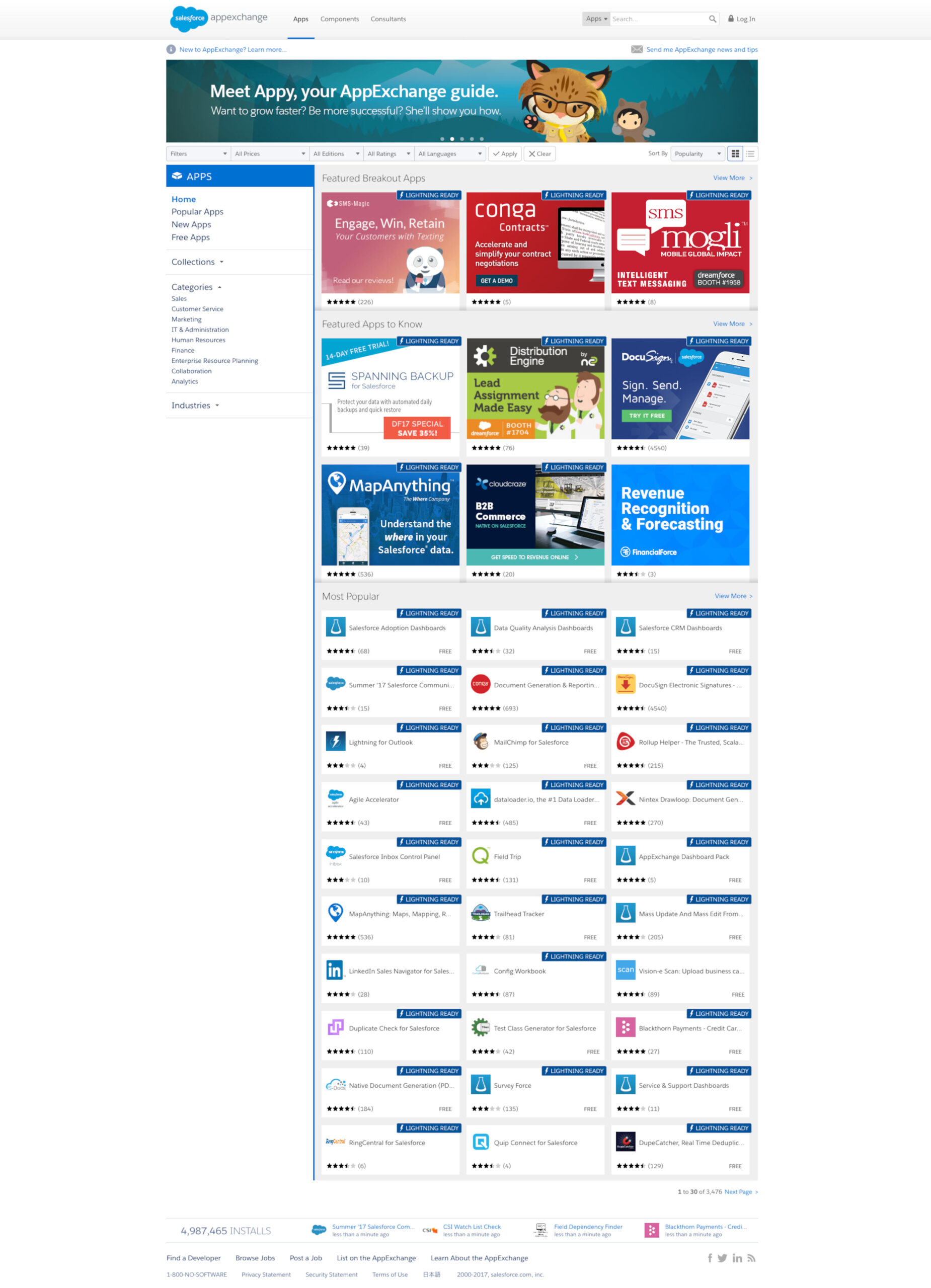
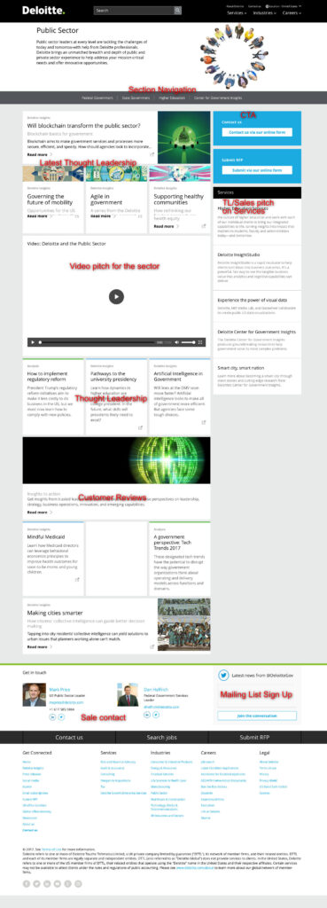
I started off by doing a competitor analysis of our direct competitors Deloitte, Salesforce App Exchange and Amazon Web Services. I also included Heroku as a similar use-case example. Ideally I would have performed user interviews and surveys with our end users to get direct feedback on their pain points and gather metrics. But we had 2 weeks to finish and the stakeholders wanted a quick turnaround.
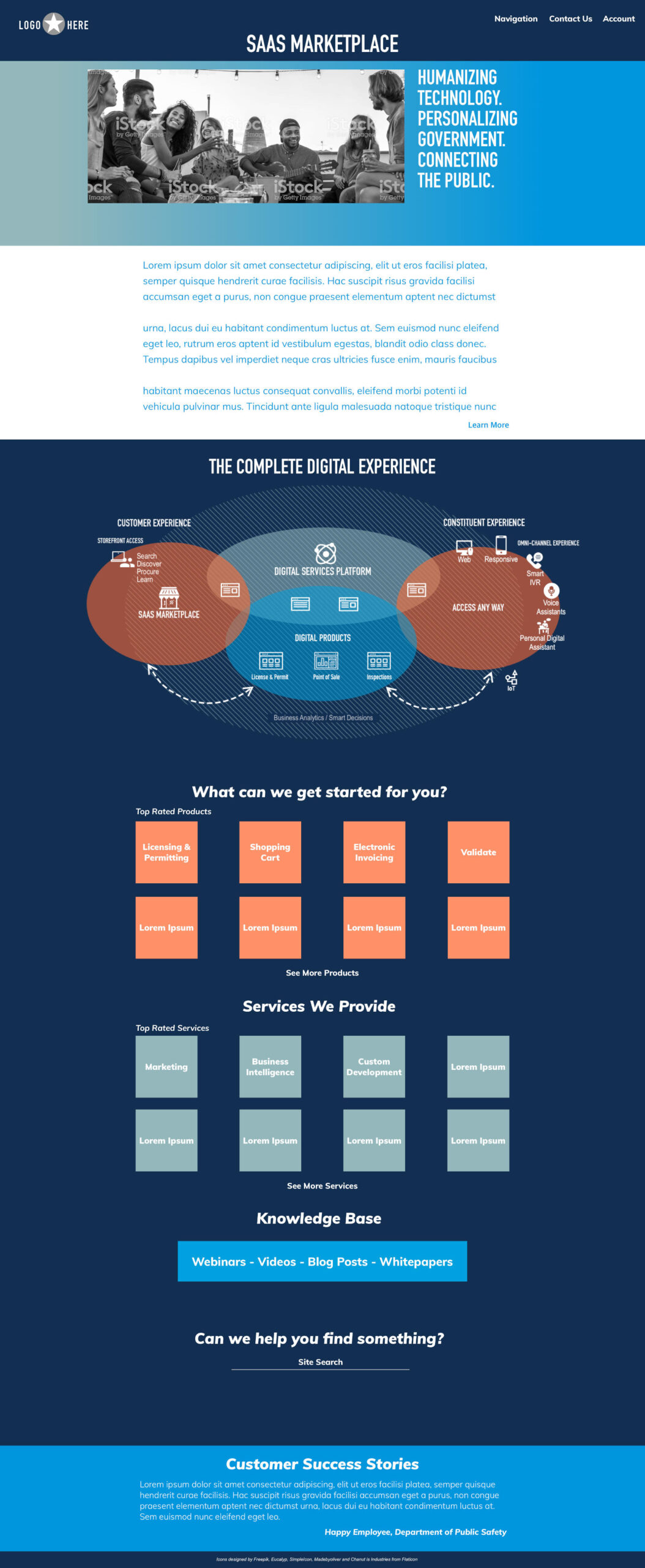
Most of our competitors offered clean, simple sites with mostly Analogous color schemes. They featured Customer Success Stories, Featured Products, Trending Products, Thought-Leadership, Videos and Charts. We adopted a similar approach to our design. We used this finding to keep the focus on the products with additional links to thought-leadership. For color scheme with stayed with the split-complementary scheme from of our branding guide as a way to stand out.

Our competitors established trust by showcasing their customer success stories. We resolved to invite some of our partners to write us about their successes with our products. They showcased their thought-leadership through blog posts with multiple videos, customer reviews, other blog content and sales pitches. We adopted a similar stance of using blog posts and videos to showcase thought-leadership.
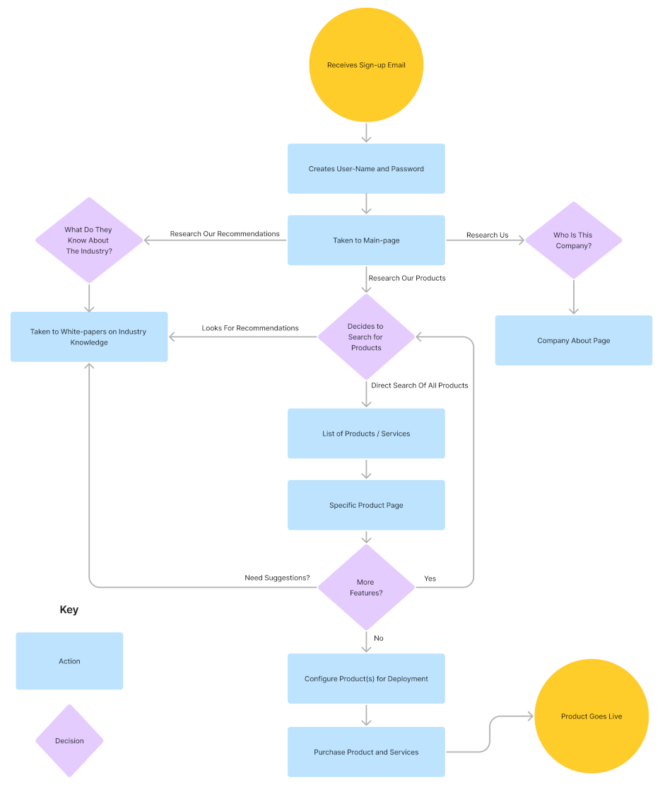
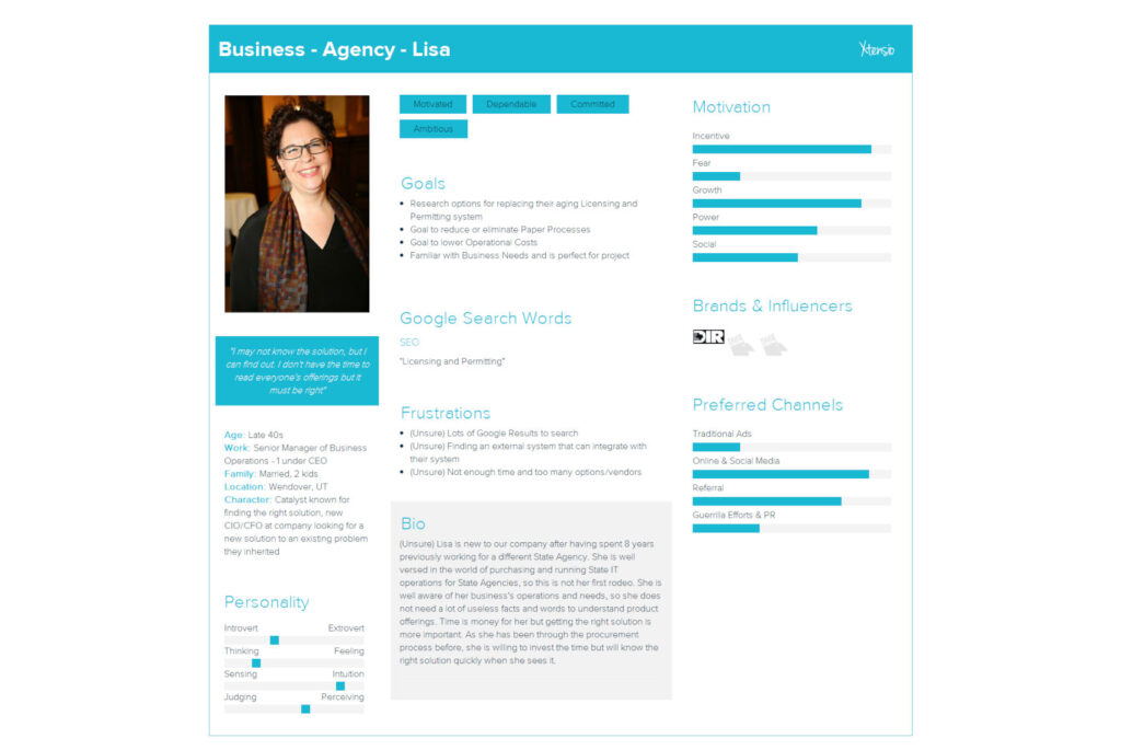
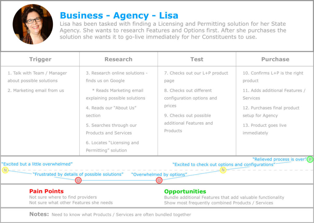
I also created a potential Persona and User Journey for our end user to be tested / confirmed later. I based them on my previous testing experience with our clients / end-users and research we had done in another project. These helped with our design process by keeping us focused on the user and their journey.
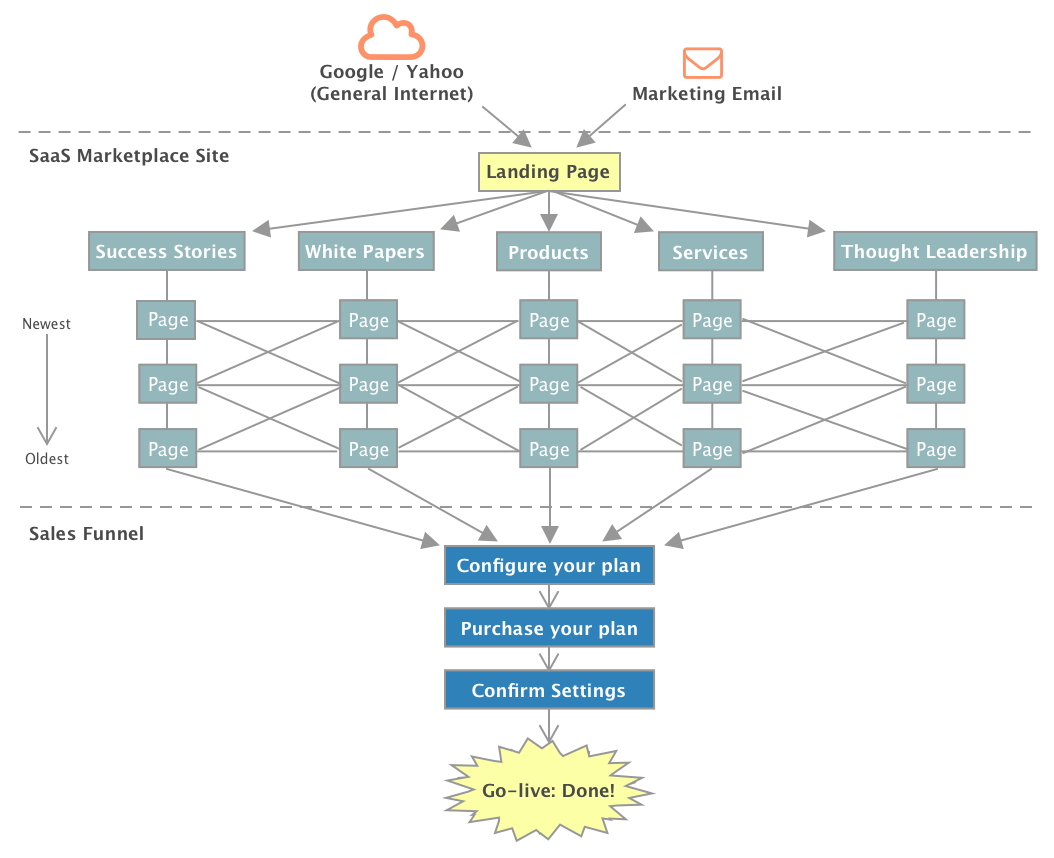
I adopted a robust Information Architecture for the project making sure that everything was accessible from within everything else.
Design Process
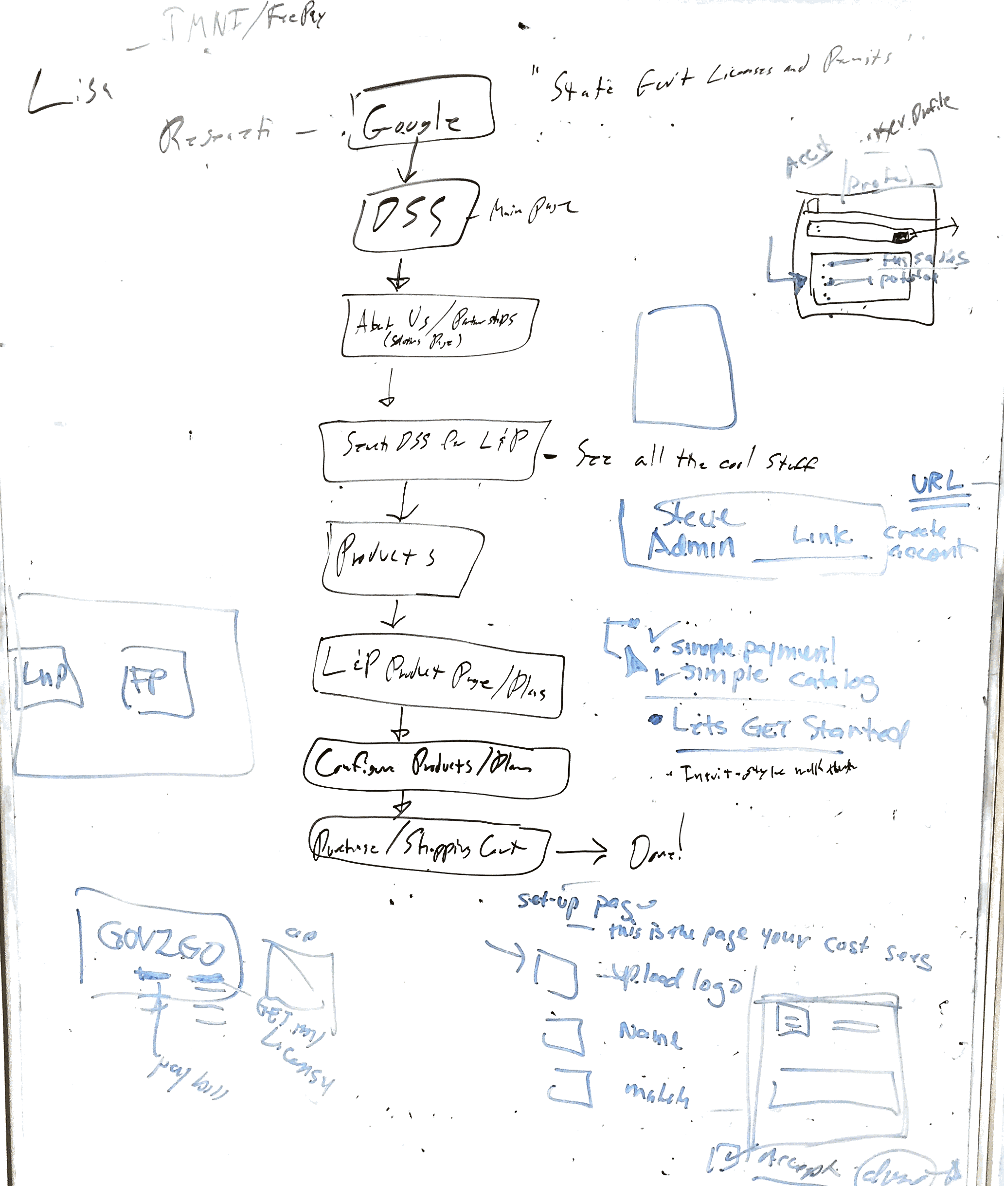
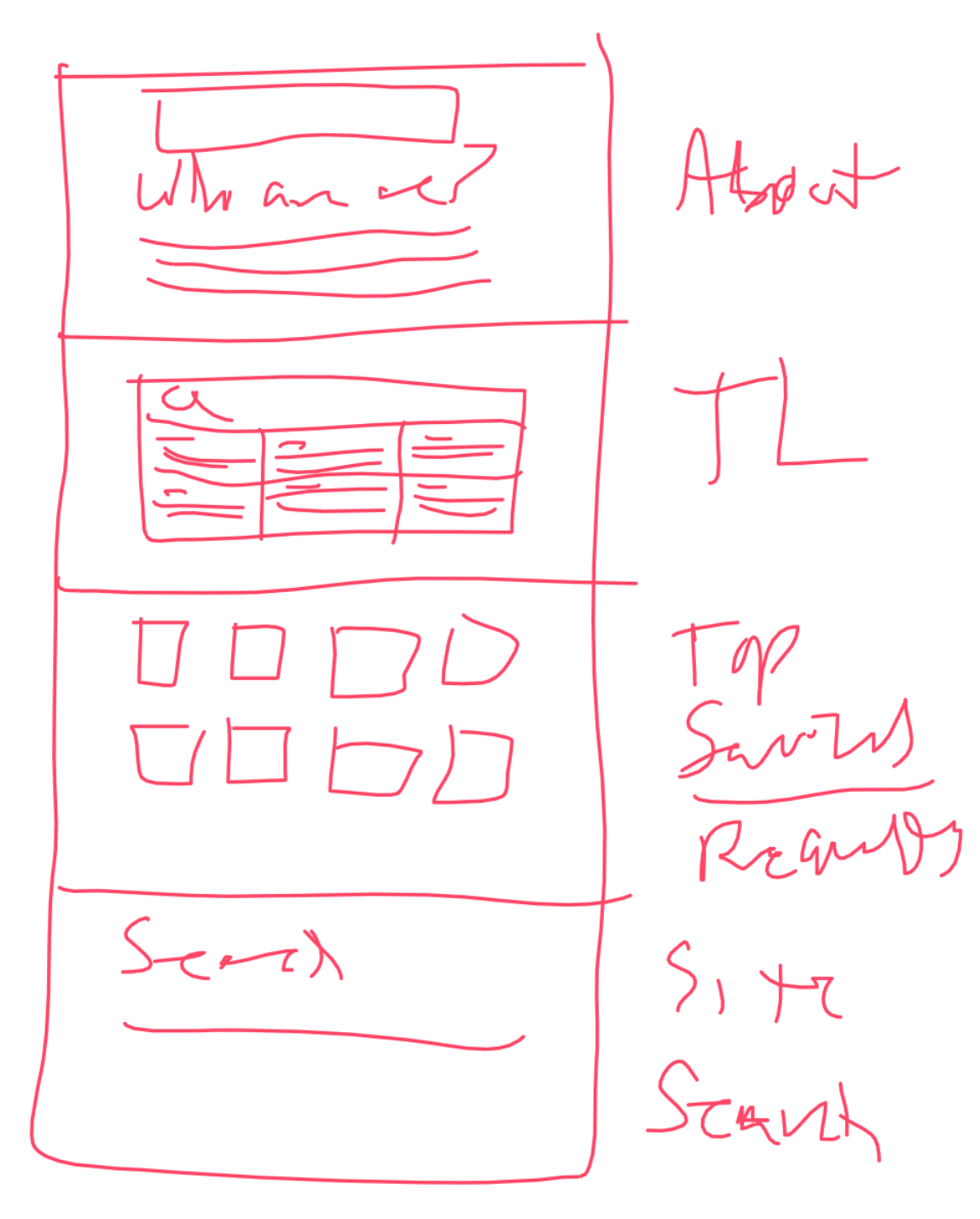
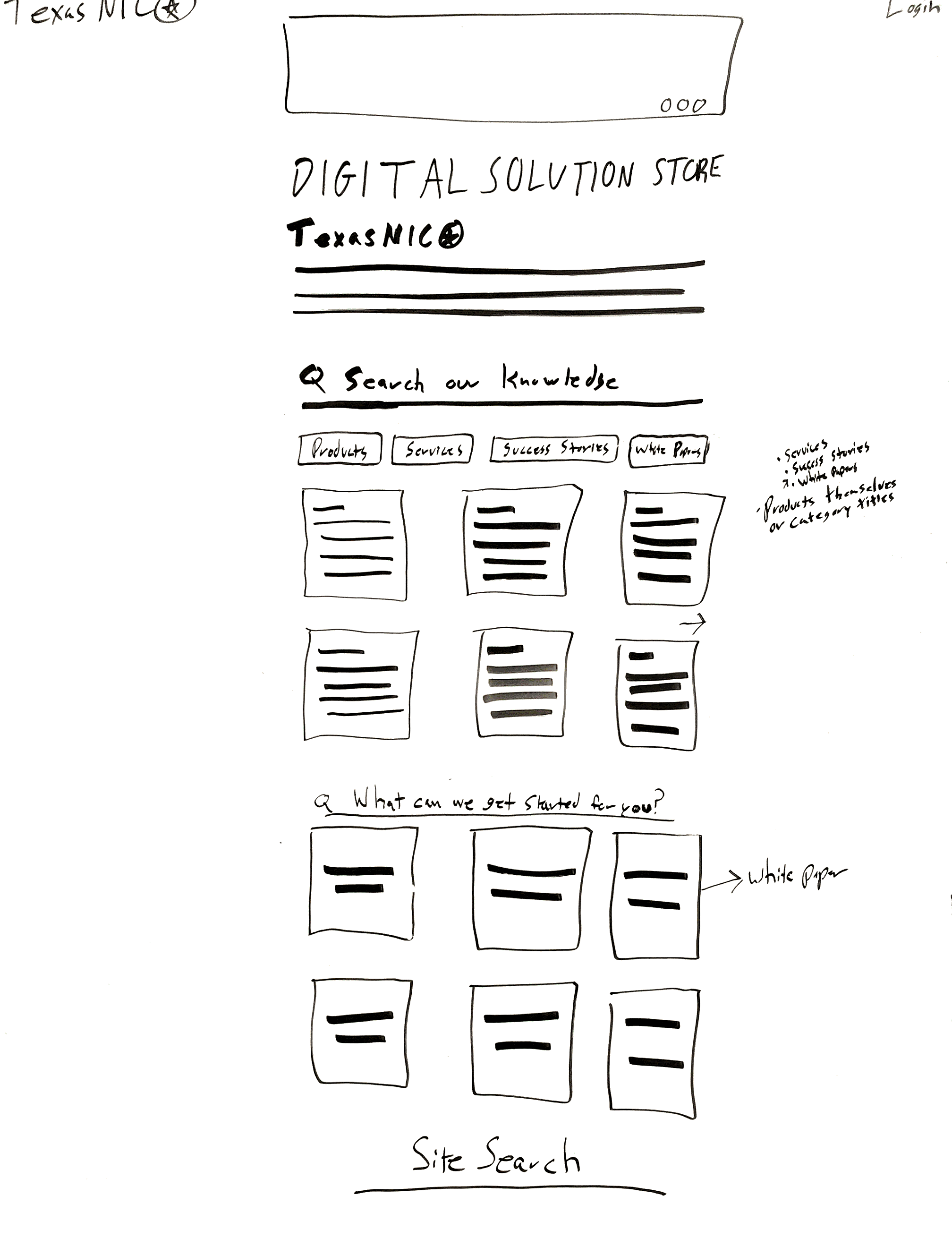
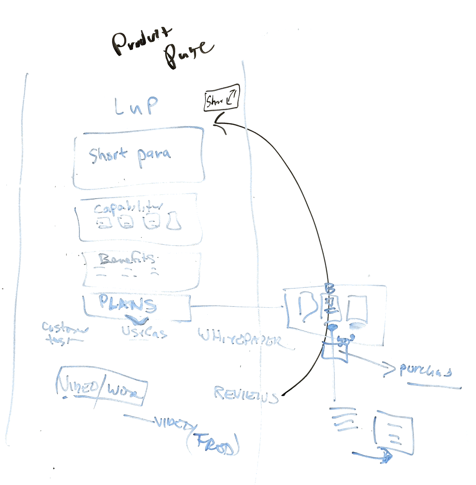
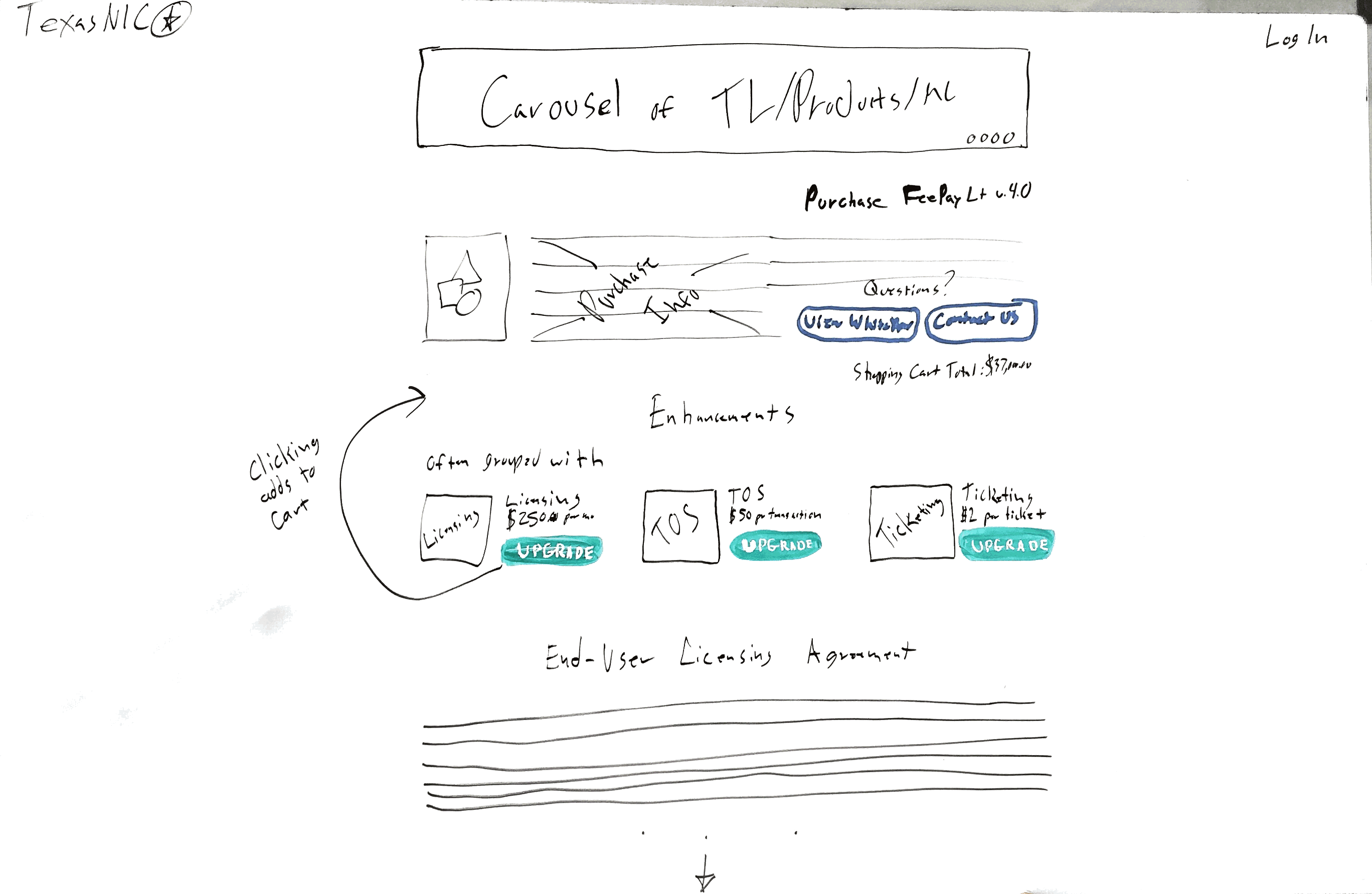
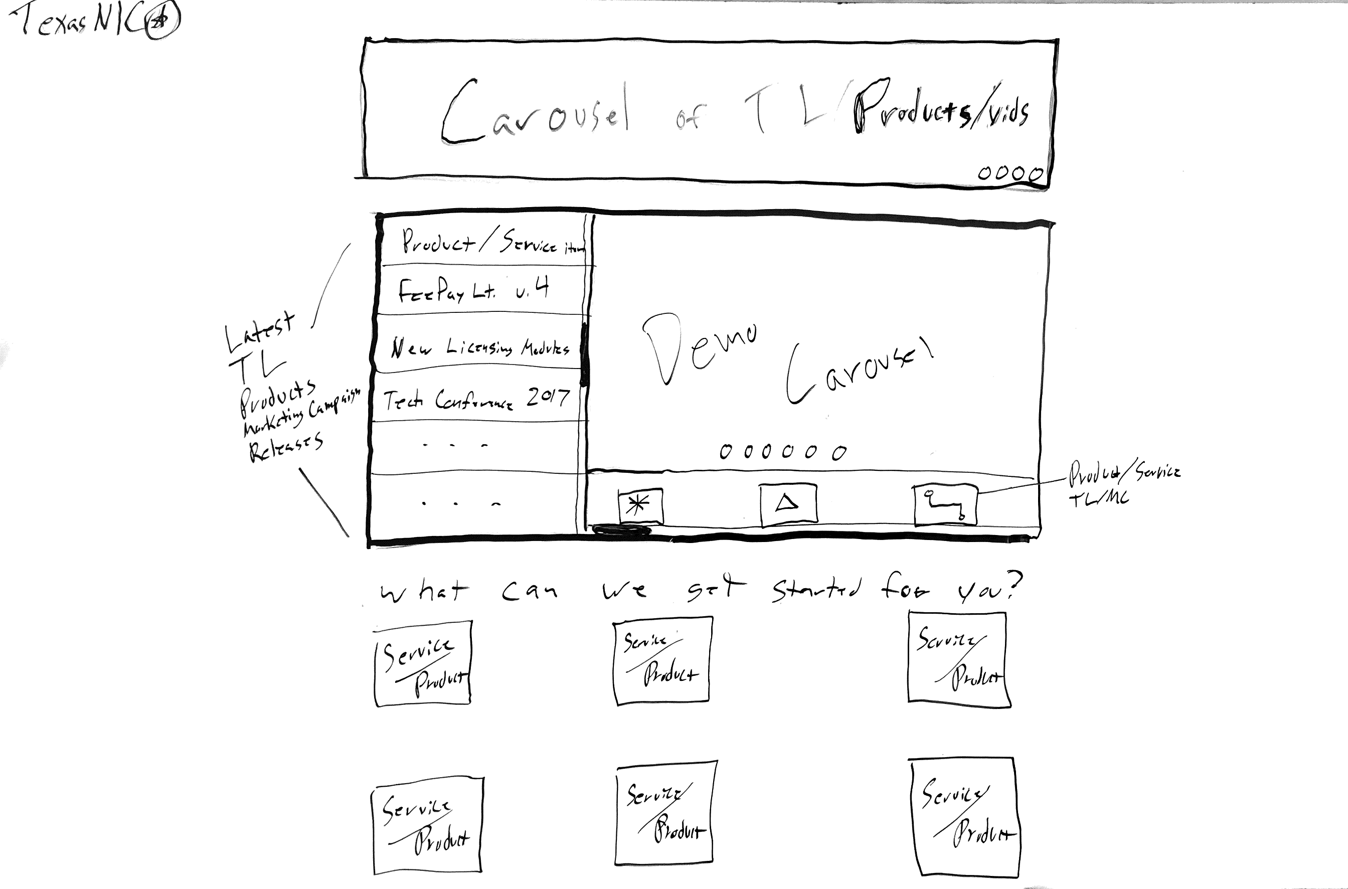
I created these designs with a Whiteboard, Invision and Sketch. Some of the designs started out in the brainstorming-phase of the project. Others were determined later based on the Requirements and the User documentation. Ideally we would have tested these designs with our users to see if they reached our goals.
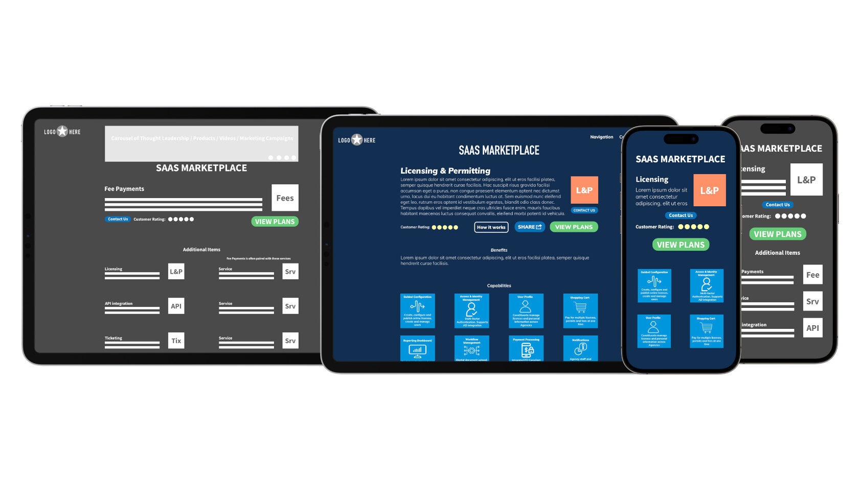
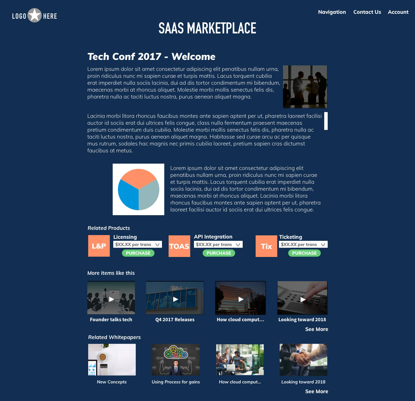
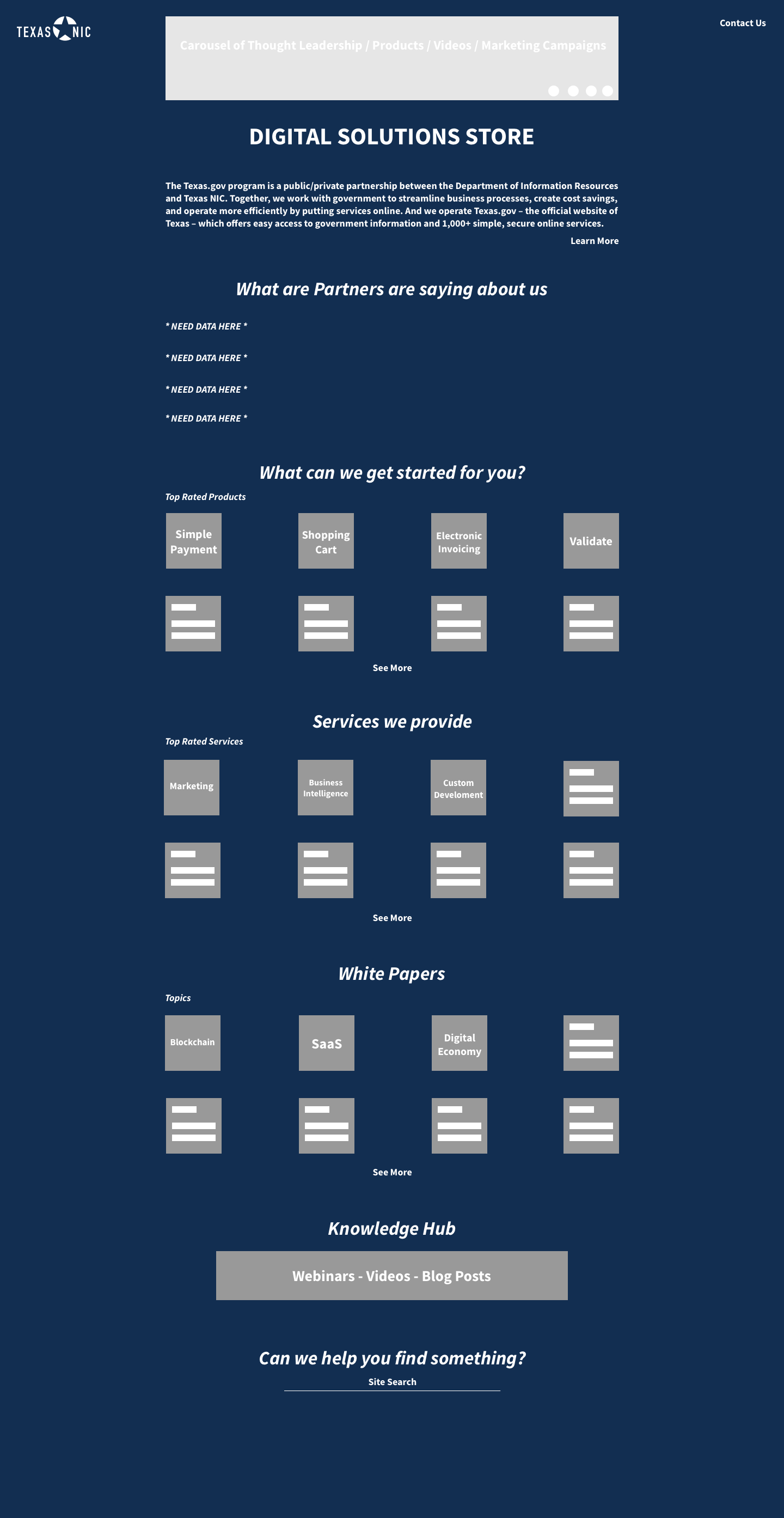
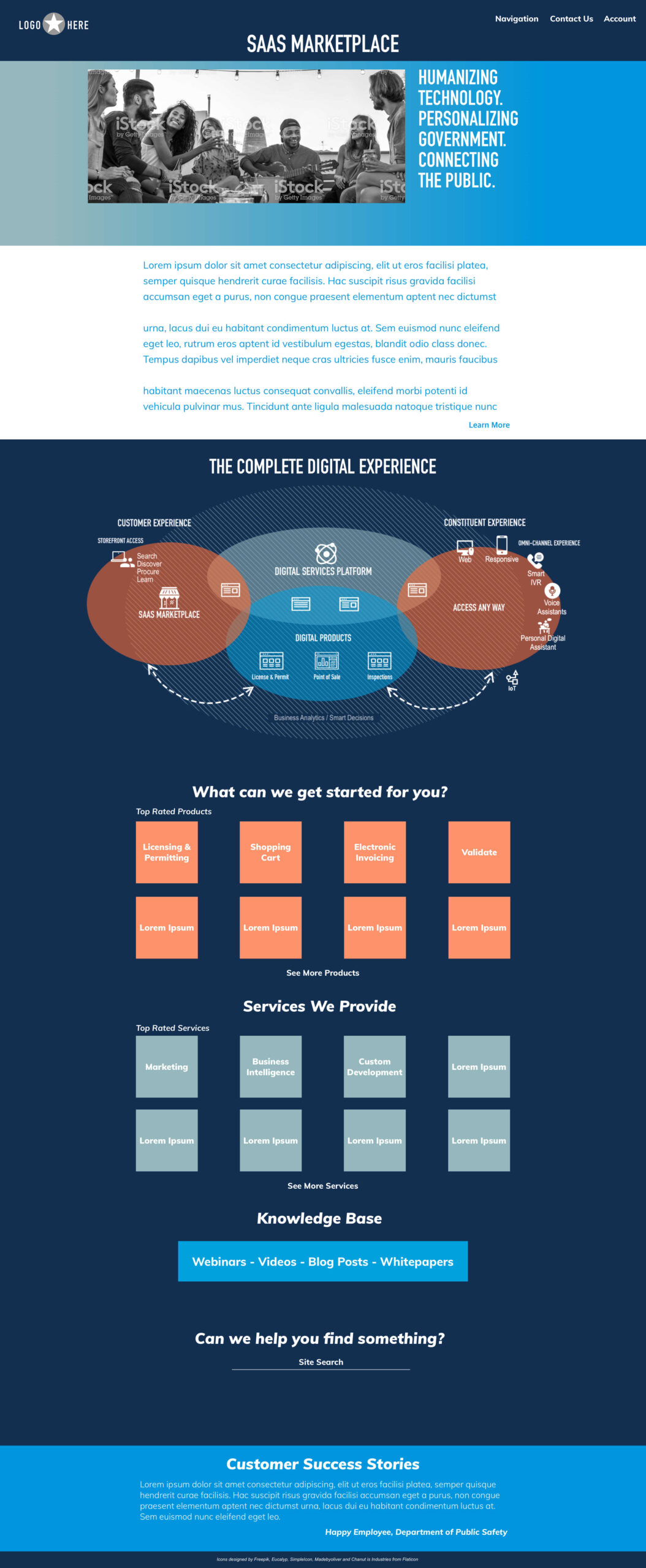
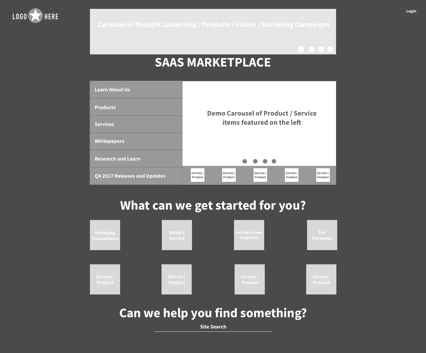
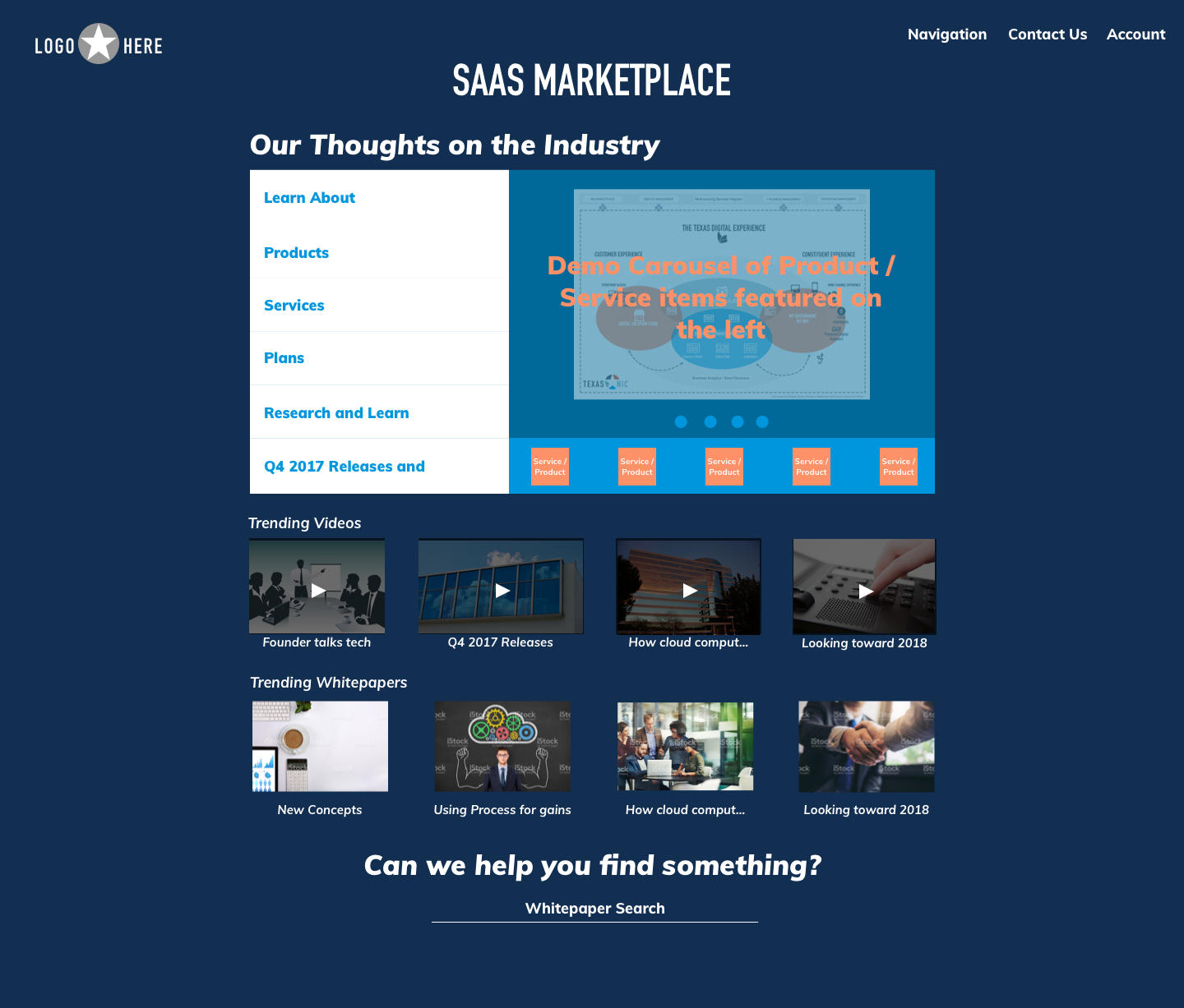
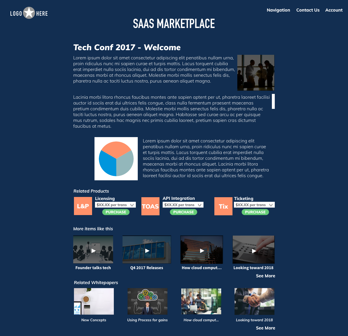
I used a simplified design to show the main page with an About, Thought Leadership, Services and Site Search. This was to keep the cognitive-load low and the focus on the Products. We determined that the landing page needed to be more graphical so we included a hero visual and a chart. Customer Success stories was moved to the bottom to not distract the user and keep the flow going to the main Products and Services. This helped with eye-flow and having the user get to the Products faster.
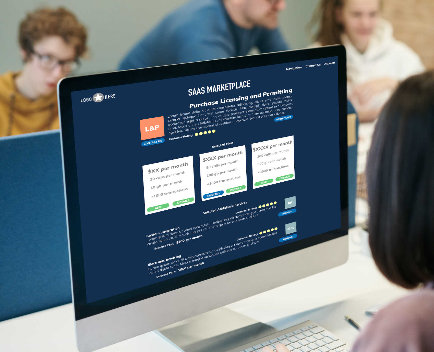
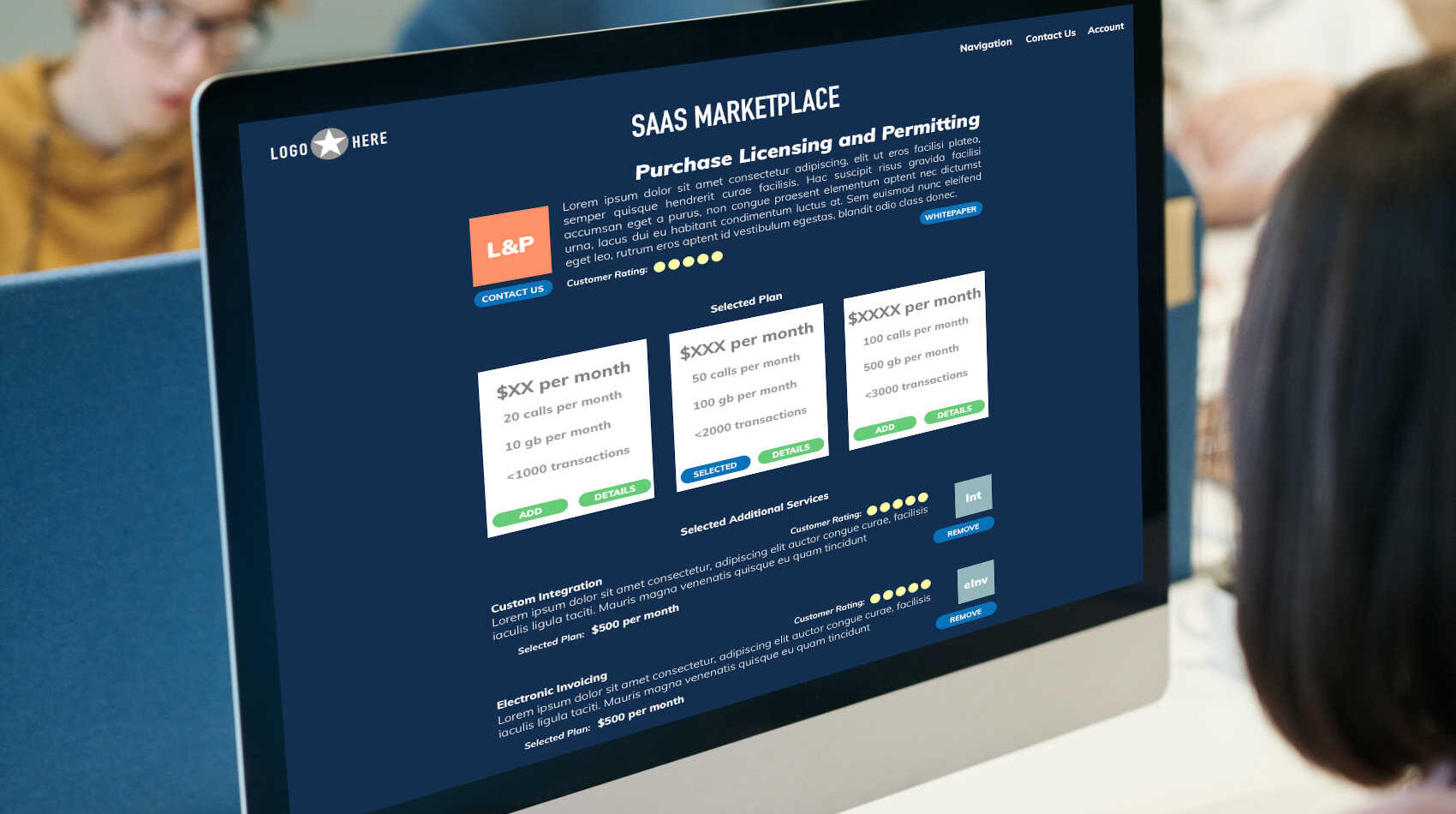
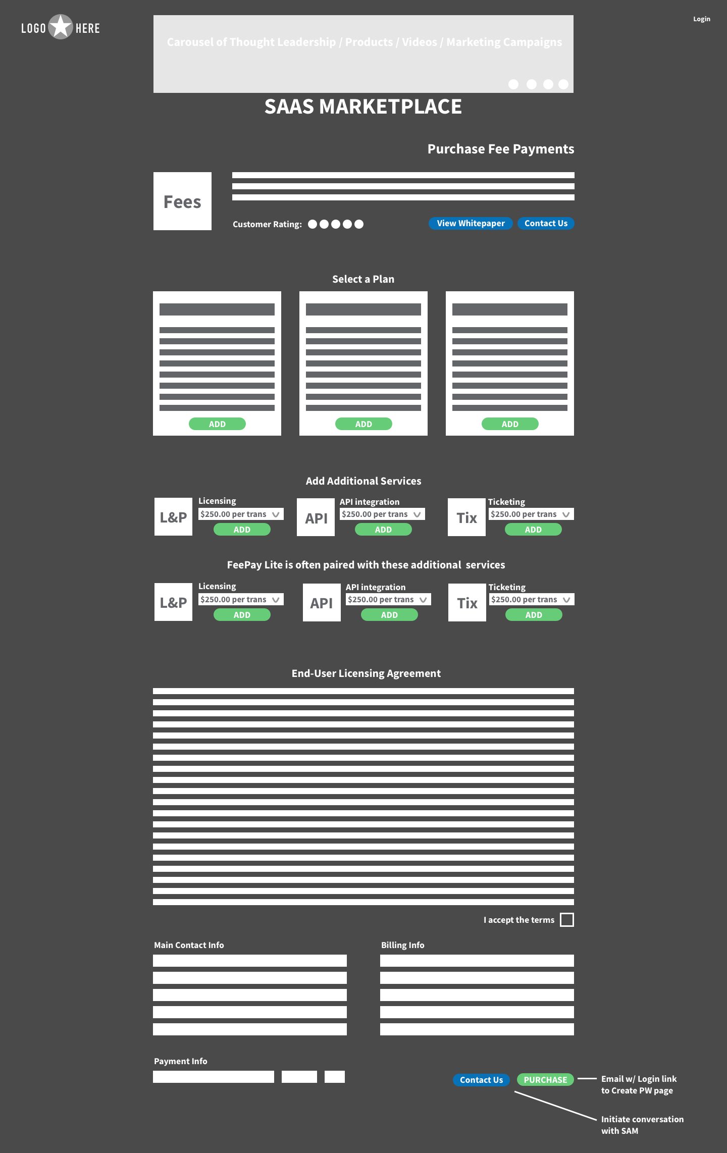
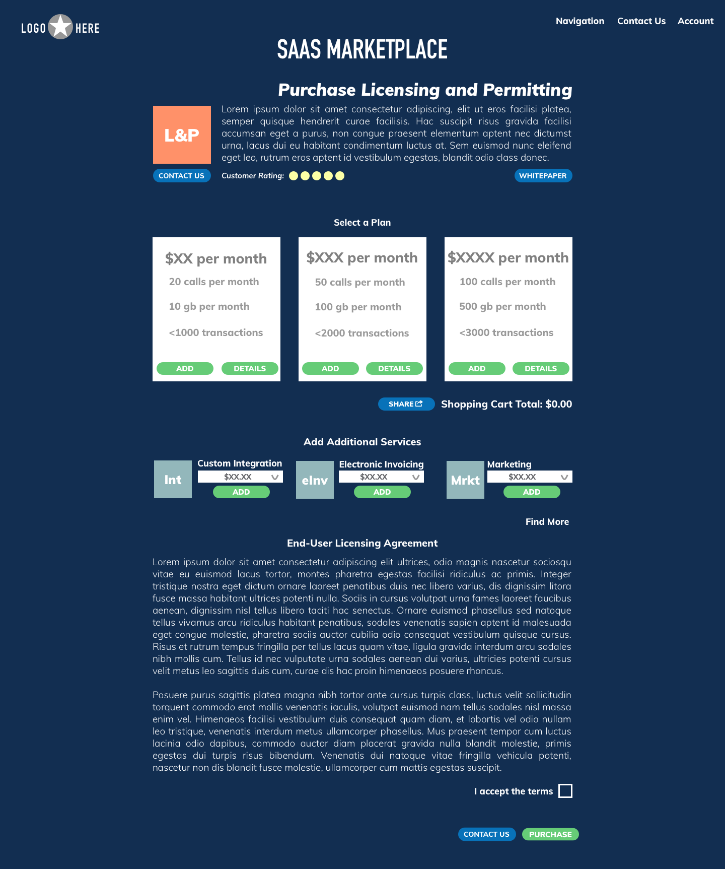
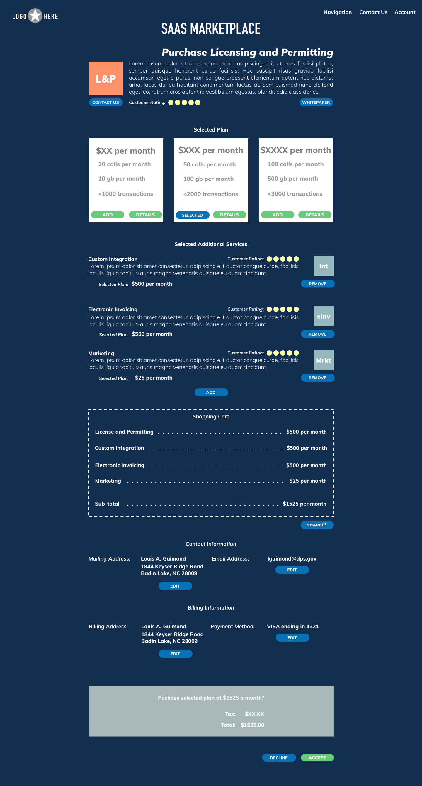
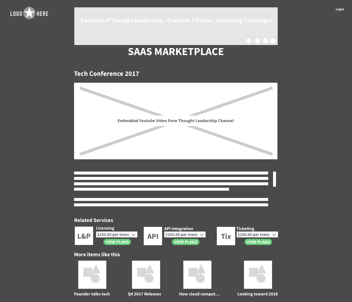
One thing we wanted to implement was a simplified configuration process so as to not overwhelm the user. We came to this based on Competitor Research and following usability best practices. For the Purchasing flow we removed the carousel as it was taking up too much space and attention away from the Products. A “Find More” link was added to encourage Product browsing. “Details” were added to each plan as a pop-up with more descriptive information. This allowed for more detail without adding to cognitive load. Billing and Purchasing information was already established when the user signed up, so it was removed in the final design. This helped with cognitive-load while keeping robust browsing flexibility.
Originally there was an idea to have a main carousel on the top of the page with the latest Products and White-papers. It was decided that this was too busy so we removed it in the final design. The additional “Products For You” was also determined to be too pushy so it was changed to show more white-papers and content videos. The Search bar was also changed to focus only on the White-papers.
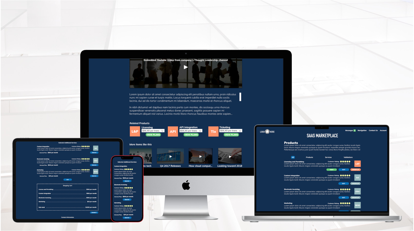
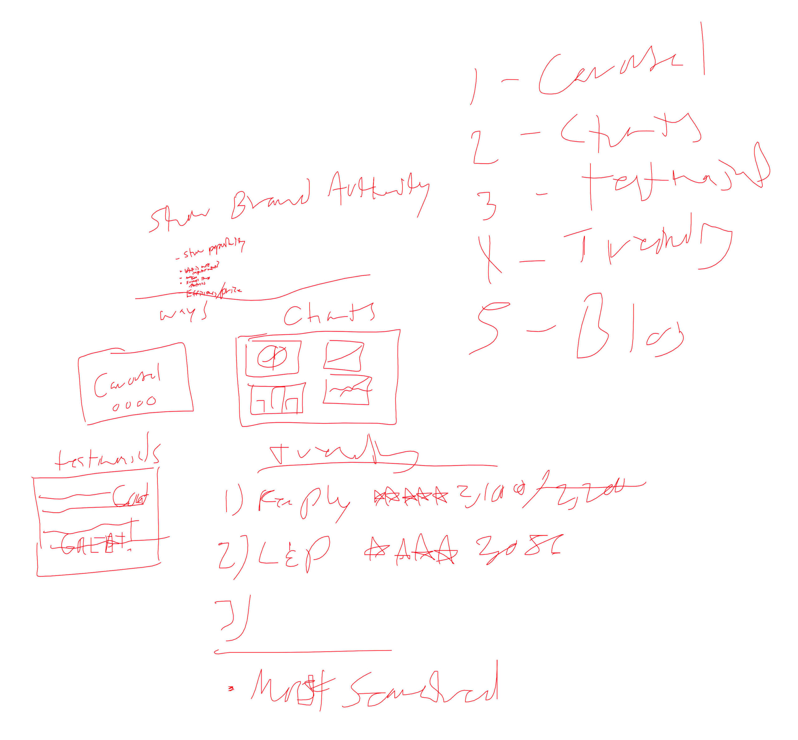
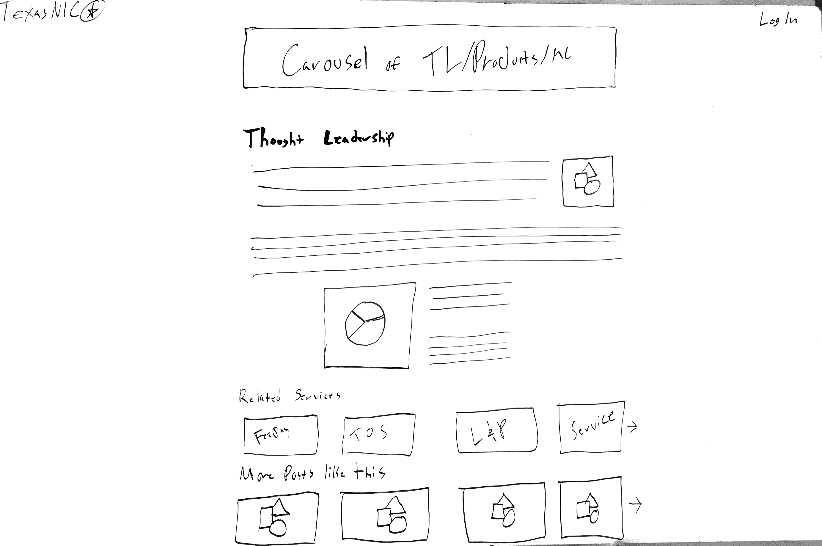
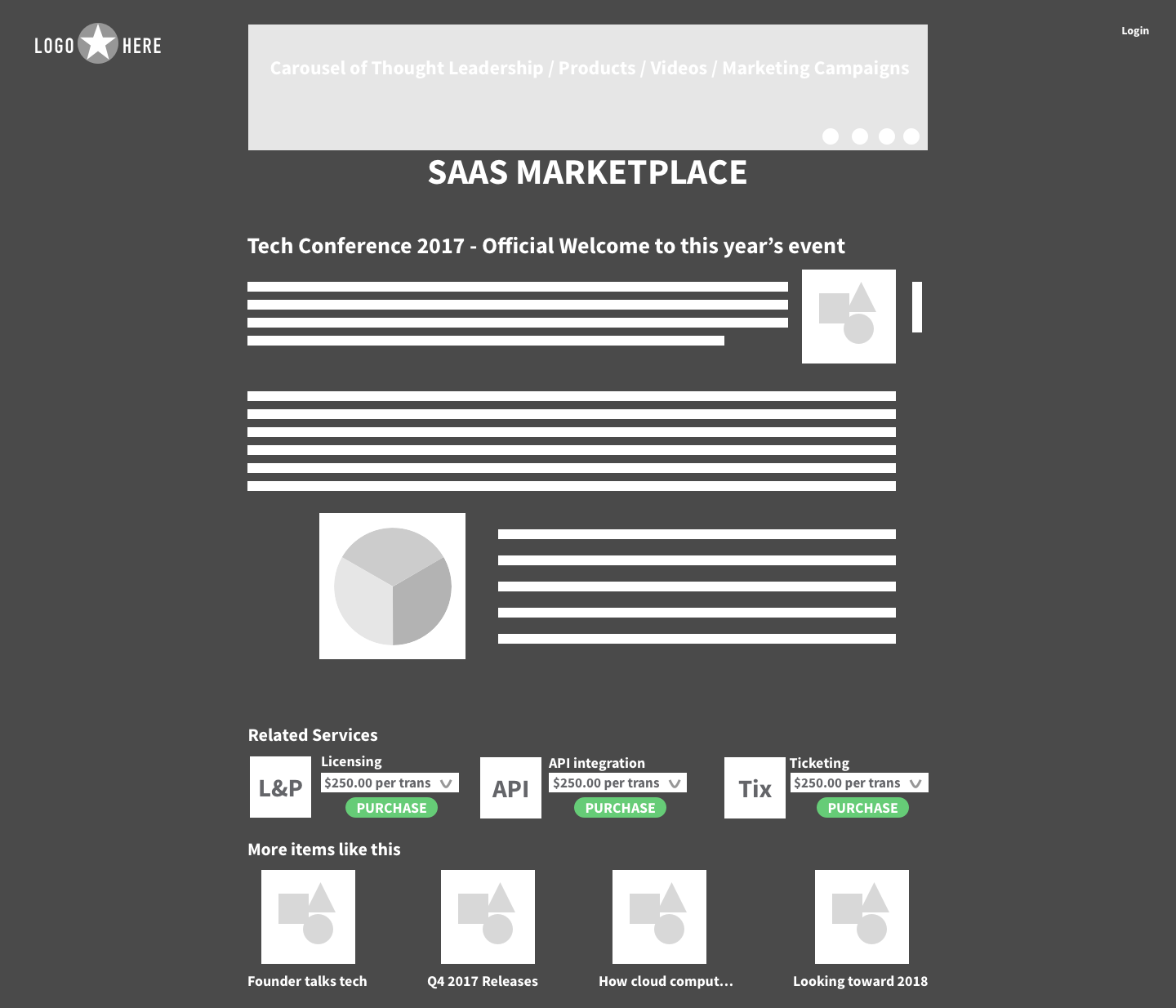
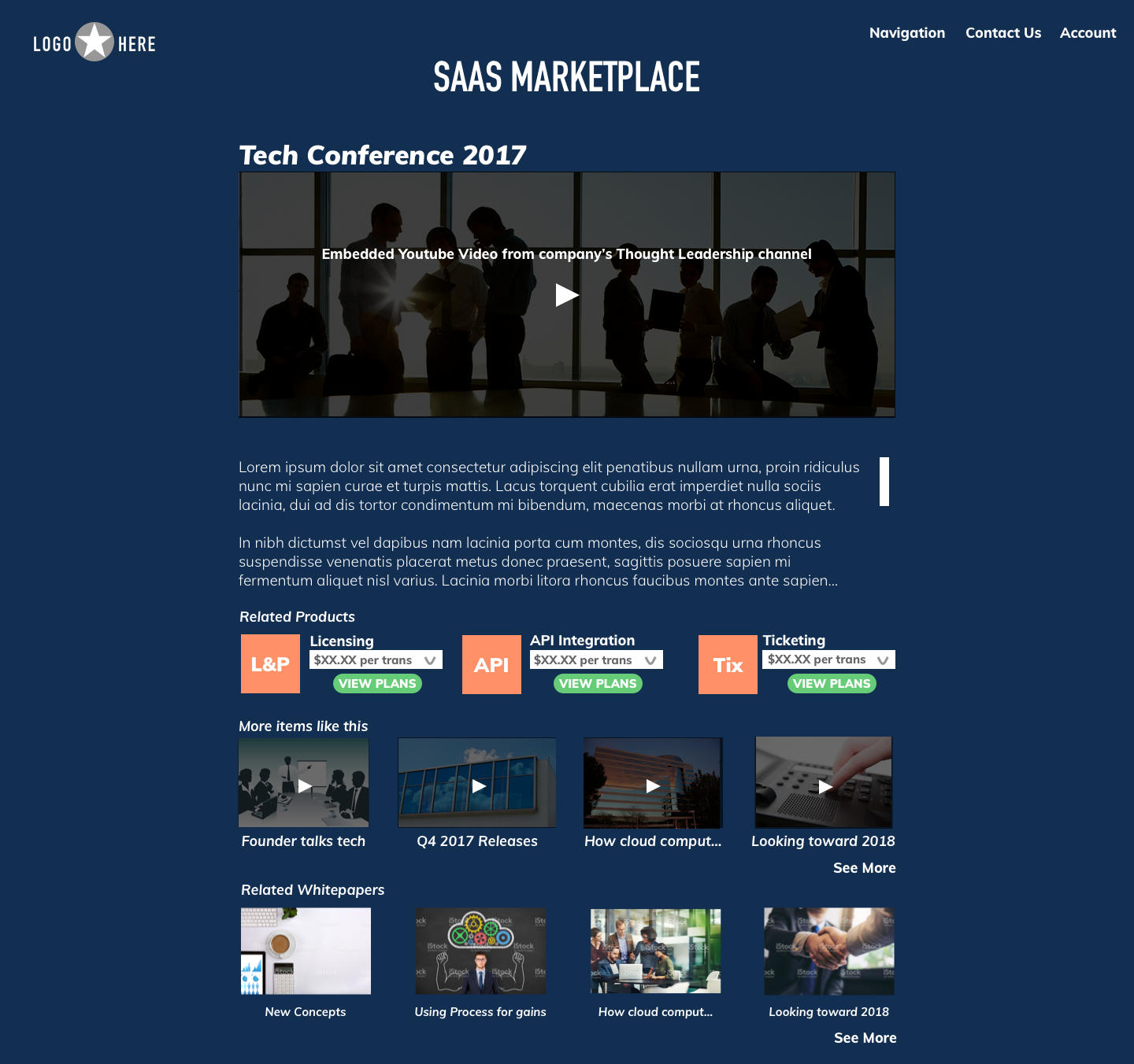
For the Thought Leadership posts I included a robust information architecture using carousels so that everything would be available from every page. I iterated over various ways to show off our brand authority. Competitor Analysis focused on Charts, Testimonials, Services that were trending, and Blog posts. The stakeholder asked for Carousels to be used. The final design uses a Chart, Related Products, Additional Blog Posts, and Related White-papers to reflect brand authority.
For Youtube videos it was decided that there would also be additional marketing text explaining the video and it’s relevance.
Challenges and Solutions
- Challenge
- Something easily configurable and not overwhelming to the user
- Solution
- Simple interface with easy add-on options that are easy to purchase
- Challenge
- No direct access to users for testing / feedback
- Solution
- Used previous research and kept track of assumptions for testing later
- Challenge
- Strict Deadline – 2 weeks to research, design and build 14 screens
- Solution
- Used Grid and Pattern Library for repeat components and styles
- Challenge
- Strict Requirements such as Carousels and direct Competitor Analysis
- Solution
- Solved all the business needs while still creating something with high usability and unique branding
Results and Impact
- Robust product that was ready for immediate development and further iteration
- Accomplished business requirements, Product Owner was pleased
- Laid groundwork for future UX discovery
Reflection and Learning
- More upfront time with end-users to make sure we are targeting direct pain points through surveys and in-person interviews
- Gather metrics to compare with our design goals
- More lead-up time could be used for more design iterations
Final Design
