Social Media Hub – Texas.Gov 2015
One of the projects I had at NIC was assisting the UX team with redesigning the State of Texas’s Web Portal (Texas.gov) for 2015. Each component was separated out among the team and I was assigned complete creative control of the social media component.
Here is screenshot of the original Social Media Hub:
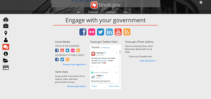
Original Site in 2014
We planned to list all of the links to the State’s Agencies social media outlets (Twitter, Facebook, Instagram, etc.) elsewhere in the site. So this left a lot of freedom for what the social media component on the front-page could actually be used for. One of the cool concepts I saw on the general web is a visual wall of social media posts from various sources. Being able to see all of these posts at once decreases the browsing and assimilation time of what is happening from multiple outlets. So I thought it would be a great way to utilize multiple newsfeeds. I considered this concept a good way to increase the interactivity with the site since the previous concept centered on being a brochure site with an inactive catalog of links. Using a wall would also create a visual newsfeed into what was currently occurring around the state in real-time –for instance with having the daily State Lottery numbers– while also providing a way to interact with that data. The hope was that adding additional filtering options would enrich the usability experience and encourage users to stay on the site longer. Maybe even assisting the site in becoming a destination for anyone of the general public interested in the latest social media updates from the local government. Ultimately providing a valuable tool and driving traffic to the site.
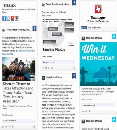
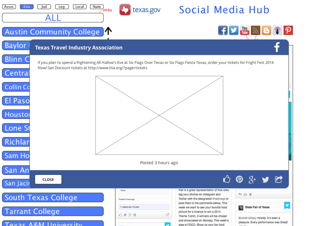
This concept is a wall of tiles consisting of pictures and text from social media posts. A wall is a great visual way to share posts because most solutions can include the images from the post. Here is an example of this concept:Most walls will load additional content when the end-user scrolls to the bottom of the presented content. This allows for an unlimited number of cards/posts to be loaded onto a page. The decision was made that in order to save on page space, the posts would have a limited amount of text shown but when clicked would open up a modal window with the post’s content. This post could then be shared while viewing the content on the user’s own social media accounts.
Highlights
- Increased interactive content without spending resources on content generation
- A live newsfeed with images – a portal into what is happening around the state
- Assisted the site in becoming more of a destination than a launch pad
- Increased User engagement time through interactive site components
Wireframes
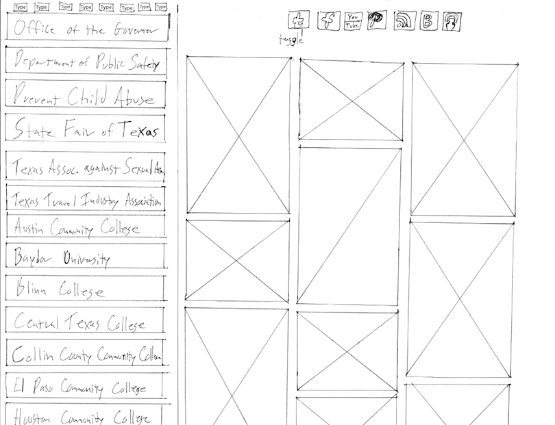
The toughest design challenge for this component was how to organize three independent layers of filtering. To provide the user with the most flexibility possible, the wall would be filterable by either Social Media Outlet (Twitter, Facebook, Pintrest, etc.), Agency type (Educational, Government, Legislative) or by a specific Agency (i.e. Parks and Recreation). On pen and paper I wireframed a concept where all of the different filters would be accessible at the same time following the single-page design concept from the main site. In this initial layout, the wall of posts is on the right with filters for Social Media outlets above and filters for a specific Agency are on the left.
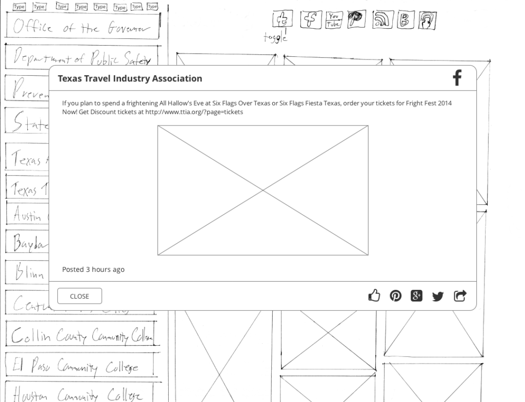
When a user clicks on a wall post, a modal would dissolve in, overlaying on the component with the information from the post and iconic buttons for the user to share the post on their own social media.
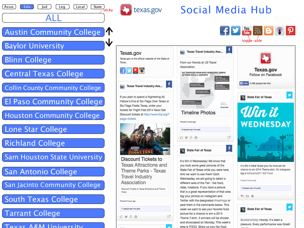
The team liked this direction and I created a high fidelity mockup in Adobe Photoshop CC for this concept. We had determined a few style elements at this point, but were not sure yet of the overall layout and color scheme. So I incorporated the elements we knew and used a monochromatic pastel color scheme, knowing that these would change in the final version. Based on feedback from the team, I included an “All” button to indicate the initial status of the wall and provide the user a way to reset the stream.
Mockups
As the overall design of the site solidified, the team decided to use a minimalist concept where the different components of the site would be hidden and thus “discoverable”. This meant the overall filtering design would need to be iterated to fit the new style concepts. And with the overall design now solidified, the component could be styled for it’s final implementation. For this final iteration, I hid the Agency filters behind a semantically labeled button (“Filters”) and stylized the social media outlet buttons. The color scheme is based on colors used elsewhere in the main site. For flexibility, this design was generated in Adobe Photoshop CC.
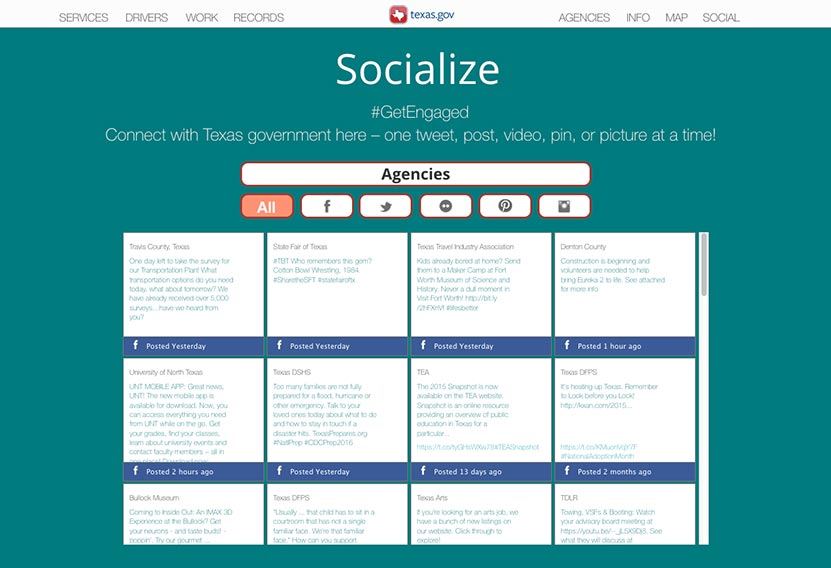
Final design iteration
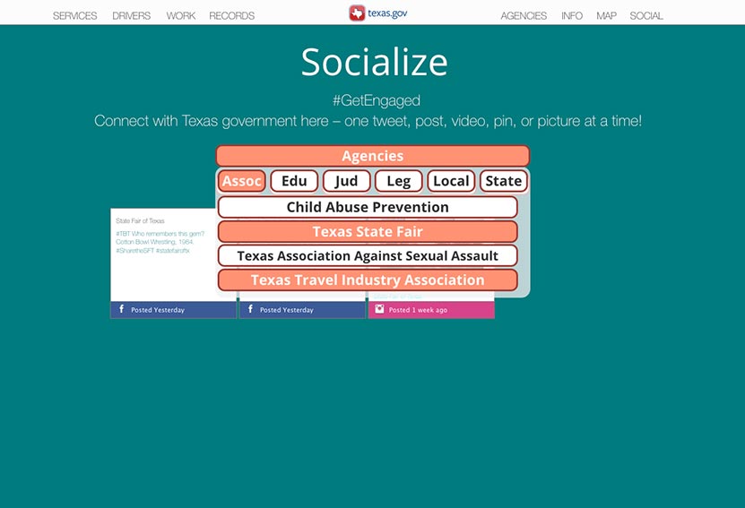
Final design iteration of Filtering concept
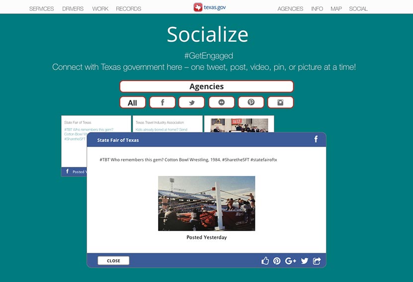
Final design iteration of viewing the details of the Post
Prototypes
To assist with actual user experience, I converted the mockup into a working prototype in Axure RP.
Here is the how the concept of the filtering would work.
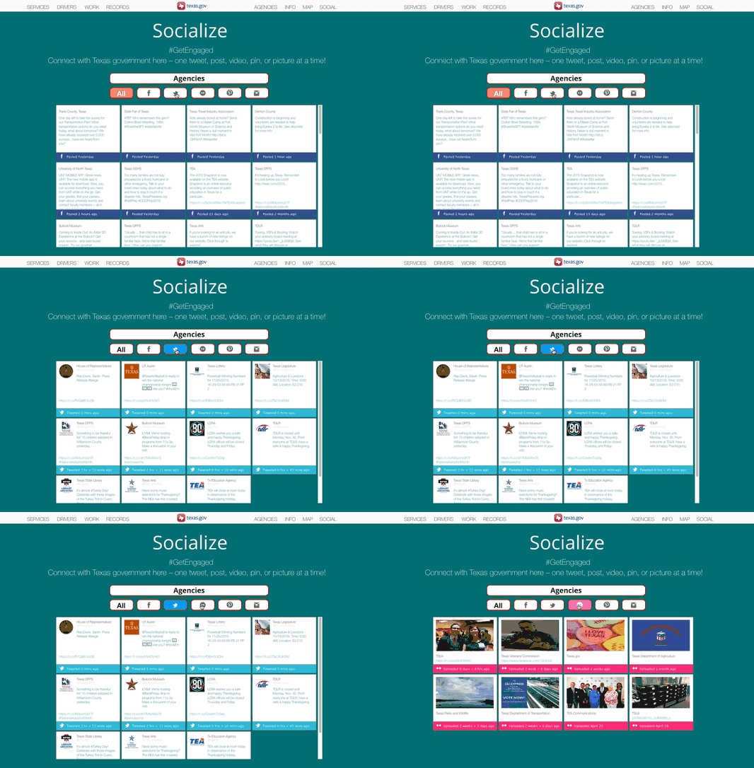
Filtering by Social Media Outlet
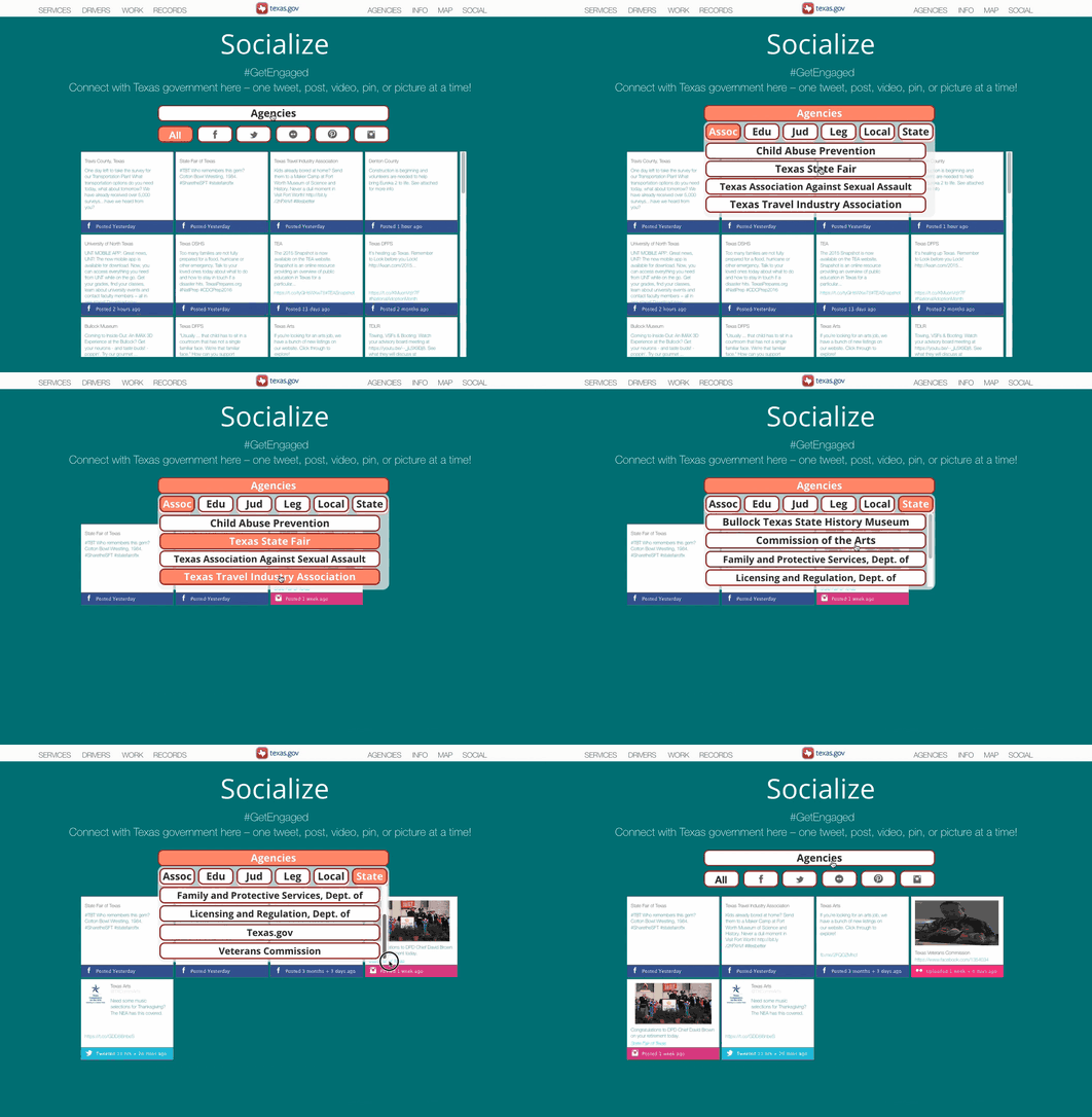
Filtering by a Specific Agency
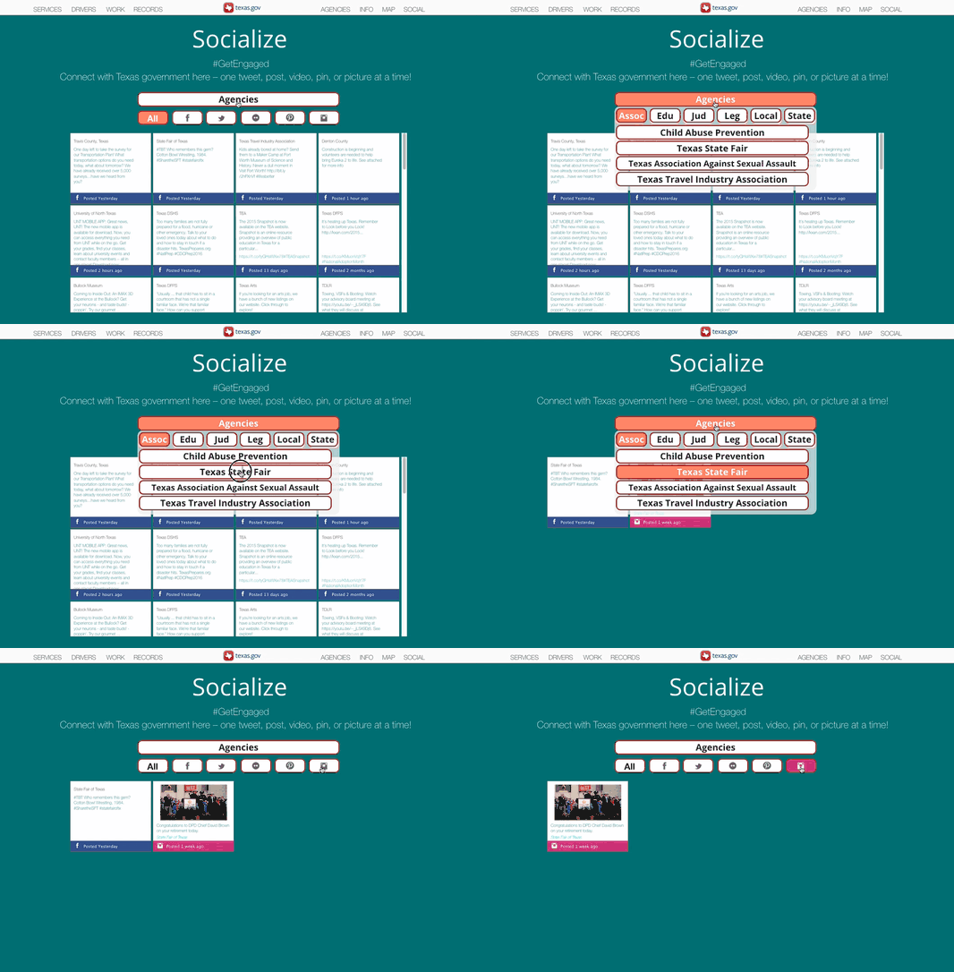
Filtering by a Specific Agency and Social Media Outlet
With the ability to share the wall posts on a user’s own social media, the hope is to encourage users to return and browse the wall.
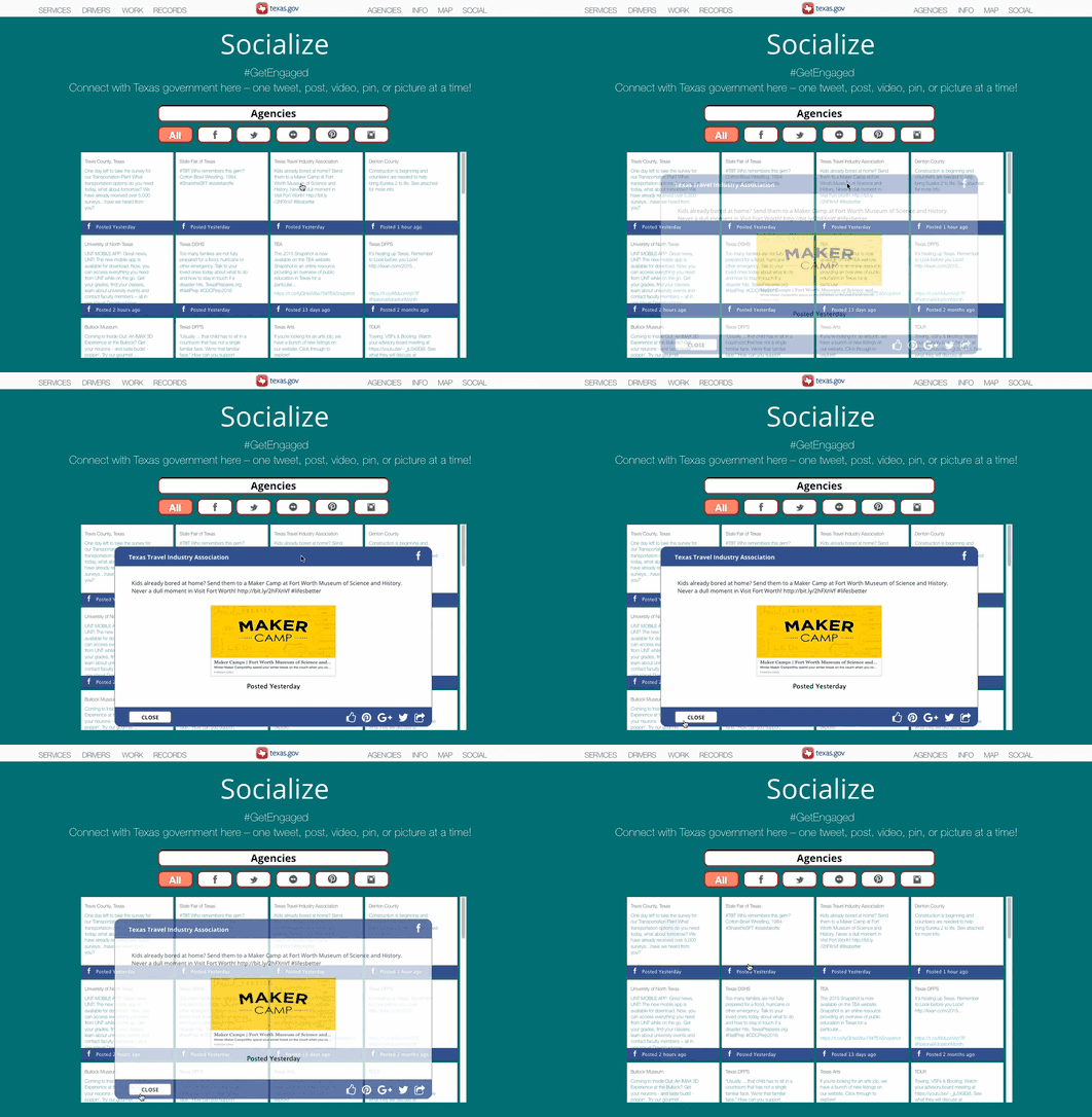
Viewing the details of a social media post
The design for this site won 5th and 4th place in Best of the Web: Government Awards.
sitemaps
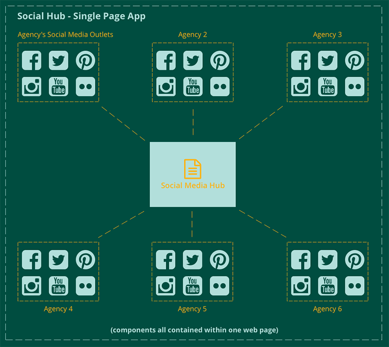
With the social media component being a single-page app (on a single-page app), the sitemap would consist of the app with different interactive components for each of the Agency’s Social Media Outlets (Twitter, Facebook, etc.).
