UX Audit
A User Experience Audit can bring insight into the reality of how users are interacting with a website. If asking the right questions, you can determine a lot of information without the hassle of finding (enough) end-users willing to submit to endless questions/testing. It shows what resources should be focused on for testing. What the site’s current market is and if it’s reaching the desired market based on data instead of opinion. This also allows for more specific Personas and influence Branding decisions because we are making what visitors like or are use to.
An audit can show how many eyeballs are on the page, how long/much users interact with the site and if visitors come back (and possibly why). This can give insight into what types of bugs should get priority and potential points of interest for the content. Also when visitors are visiting (and possibly why), which informs use when we can do maintenance windows without much impact.
There is also insight into what our Search Engine Ranking would be and how long do visitors have to wait for our page to load. These insights help us to understand how the users experience our site.
For this audit, I analyzed the current iteration of Texas.gov.
Highlights
- Utilized Google Analytics and Hotjar (Heatmaps) for UX/UR/IxD research
- Looked at several dimensions: Top Browsers, Visitors, Lifestyles and Interests, User Flow and Site Performance
- Discovered several previous unknowns: who/how often users visit the site, what is the most popular browser, what components get the most traffic, what people use the site for, how well the site runs on a user’s browser, etc.
Top Browsers
Using Google Analytics, we see the majority of our visitors are using Desktops (67%) to visit our site, followed by Mobile devices (27%) and Tablets (6%).
The top operating systems that visit Texas.gov:
- Windows (4)
- macOS (4)
- Android (2)
The most popular types of browsers are:
- Chrome (3)
- Safari (3)
- IE (2)
- Firefox (1)
- Samsung Internet (1)
The top 10 most popular browsers are:
- Chrome on Windows (30%)
- Safari on iPhone (12%)
- IE11 on Windows (11%)
- Chrome on Android (9%)
- Edge on Windows (9%)
- Safari on macOS
- Firefox on Windows
- Chrome on macOS
- Safari on iPad
- Samsung Internet on Android
Utilizing these metrics, we should ensure that we always test the site with these browsers. Depending on severity, we should prioritize any bugs on Desktop and Mobile over Tablet. And while it’s always best practice to focus mobile first, Desktop layouts should take priority during design and testing depending on our content release cycle. When coding the site, we should be mindful of the native browser compatibility issues with these browsers.
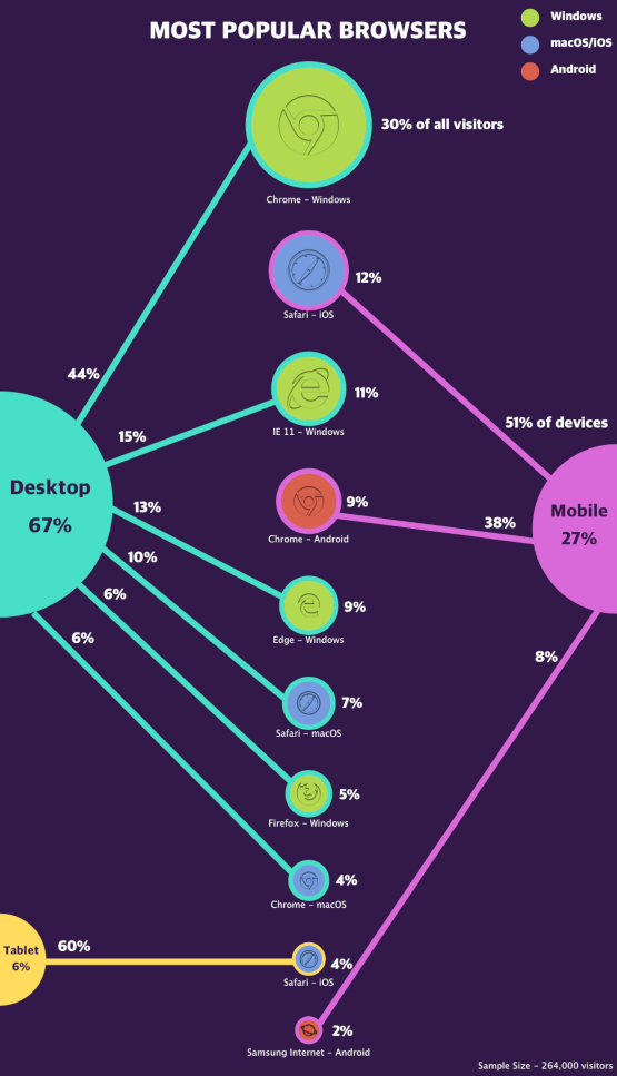
Most Popular Browsers Infographic
Visitors
Most of our visitors are from within the state of Texas (87%) with a few from other states and countries (13%). The majority of visitors come from various small cities around the state (54%), the minority are from larger cities.
The cities with the most visitors:
- Houston (17%)
- Dallas (11%)
- Austin (7%)
- San Antonio (7%)
- Fort Worth (4%)
Most users are first time visitors (87.5%) with a few revisits (12.5%). The visitors who return often do the next day (47%) or within a week (2%). The average time spent on the site in a single visit is less than two minutes (1 minute, 45 seconds).
The largest take-away is that users are not spending a lot of time on the site (< 2 minutes). Further research would be needed to determine why session times are so short. Most of our users are rural Texans. A possible hypothesis for this is because city services are more difficult and time consuming to reach in rural areas while more readily available in urban settings. Further studies should be done to see what services these users are attempting to access and the rate of local availability. When redesigning this site, these services should be more readily available for users. There is also potential here to expand our product offerings to accommodate this demand for services.
The busiest times for the site are
- 9am to 4pm Monday through Wednesday
- 10am on Thursday
- 11am and 1pm on Friday
The least busiest time for the site is 11pm to 7am Monday through Sunday. Site updates and maintenance windows should be scheduled in this time period.
Most visitors directly access the site by typing in the URL into a web browser by name (82%) or finding site content through a Search engine (12.5%). Depending on Marketing objectives, SEO should take less priority.
The most common language set on visitor’s browsers is English (96%), then Spanish (2%) and various others (2%). Bugs on the English section of the site should take priority.
Males tend to visit more (52%) than Females (48%). The most frequent age groups are:
- Millennials (age 25 – 34 – 25%)
- Late Gen Xers (age 35 – 44 – 23%)
- Early Gen Xers (age 45 – 54 – 18%)
- Late Boomers (age 55 – 64 – 14%)
- Gen Zers (age 18 – 24 – 11%)
- Early Boomers (age 65 – 99+ – 9%)
Future User Research should focus on English speaking Millennials and Gen Xers (age 25 – 54) from smaller towns in Texas to determine what they use the site for. Most visitors arrive during normal business hours by entering the address manually and stay for less than two minutes.
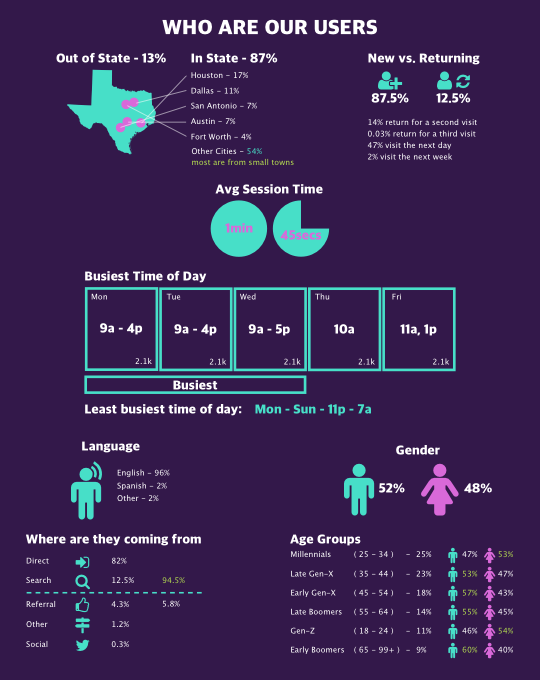
Visitors Infographic
Lifestyles And Interests
The Top 10 lifestyles (which is similar to TV audiences) of our visitors:
- 30 minute chefs (female 35 – 44)
- Value Shoppers (female 25 – 34)
- Entertainment and Celebrity News (male 35 – 44)
- Business Professionals (male 35 – 44)
- Avid Investors (male 35 – 44)
- Do-It-Yourselfers (male 35 – 44)
- Family-Focused (female 35 – 44)
- Fast Food Cravers (female 35 – 44)
- Pet Lovers (female 35 – 44)
- TV Lovers (female 35 – 44)
The types of purchasing they are making are:
- Selling Real Estate (female 35 – 44)
- Hotel Bookings (female 35 – 44)
- Buying Home Decor (female 25 – 34)
- Buying Preowned Home (female 35 – 44)
- Buying Used Motor Vehicle (male age 35 – 44)
- Buying Home Furniture (female 25 – 34)
- Searching for Employment (female 25 – 34)
- Booking Air Travel (female 35 – 44)
- Investment Services (male 35 – 44)
- Home & Garden (female 35 – 44)
More specific interests for our visitors (and what GA tells us is a “Truer Metric”) are:
- Entertainment News (male 45 – 54)
- Email and Messaging (female 35 – 44)
- Big Box Stores (female 25 – 34)
- Weather (female 25 – 34)
- Residential Sales (female 25 – 34)
- Online Video (male 25 – 34)
- Air Travel (male 35 – 44)
- Cooking and Recipes (female 25 – 34)
- Dictionaries and Encyclopedias (female 25 – 34)
- American Football (male age 45 – 54)
There are potential groupings with this analytics data that give insight potential meta behavior/mindsets of our users. We can create hypothesizes for Personas and User Flows that can be confirmed through more research.
- People in the workforce – Business Professionals, Searching for Employment, Dictionaries and Encyclopedias
- People Stay Home (and consume content) – Real Estate – buying/selling pre-owned homes/residential sales/do-it-yourselfers, Shopping – big box stores/value shoppers/buying home decor, Cooking – 30 minute chefs/cooking and recipes, Family Focused, Entertainment News, Online Videos, American Football, Pets
- People Like to Travel (probably on Vacation) – booking air travel/travel
- People Like to Shop – Shopping, Motor Vehicles, Pets
- Visitors are very comfortable with the internet – most tasks are basic life tasks
With our age demographics being between 25 to 54, this behavioral data suggests our visitors are entering the workforce or moving through it. They are purchasing their first (or second) homes and the things that go in them. The collected interests suggest they are spending the majority of their time at home. They also like to take vacations and go shopping. The high volume of basic life functions suggest they are very comfortable with performing basic life-tasks online.
The site’s content should be reviewed for things related to our visitors interest. This content should be included in the “Search Suggestions” shortcuts to check if that increases user engagement.
The Social Media Hub component could be of interest to our visitors if the stream content was curated more toward visitors’ interests. But the Heatmaps suggests no one is seeing it. Drawing more attention to this content might increase retention and session time. There has been talk of creating a weather widget and user behavior data suggests our visitors would be interested in this feature.
With this start, User Surveys and Interviews could help determine how close to reality these metrics are. Personas could then be made and wireframes/mockups could be generated for early prototypes of possible redesigns.
A/B Testing could be used to check if new sections designed around user’s interest would increase user engagement.
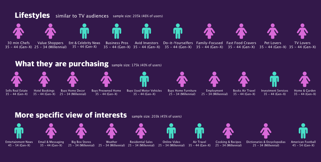
Lifestyles Infographic
Visitor Takeaways
Are main visitors are males aged 25 to 54 from rural and smaller townships who access our site from a desktop computer for less than two minutes.
The most popular times for the site are between 9a – 5p by directly entering the URL.
Visitors are active in the workforce, spend most their time at home when they are not traveling or shopping. They are very comfortable performing basic life-tasks online.
User Flow
We can see from Google Analytics and Hotjar’s Heatmaps that within a user session (average 1 minute and 45 seconds) only 10% of our users click on something other than the homepage or scroll below the fold.


We loose 87% of our users after they visit the site and before they take any action. We loose an additional 64% of our users after they interact with the Search bar or FindIt table. Only 14% of our users return for a second visit.
Additional research should be conducted on Search terms to determine user success rate interacting with this component.
This suggests they may not have trust in the site’s content or they may get tired of waiting for the site to load. It also suggests that users are not finding what they need and are abandoning the site in favor of searching directly for what they need.
To increase interaction with the website, we could test using alerts to point out different features on the site. Surveys could also be used to see what users are looking for. The Social Media hub could have more streams from local townships with the ability to filter by region. The section on Government Agencies could also include a section with local offices for townships. Time permitting, another level of data could be added to every component to include information for smaller townships.
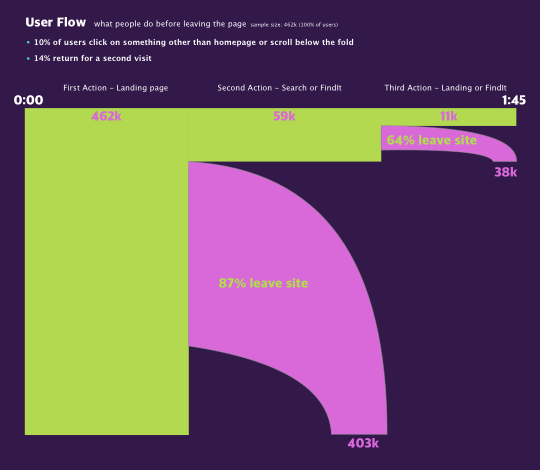
User Flow Infographic
Site Performance
Google Pagespeed Score indicates how Google sees the site programmatically and where it ranks in their Search results. Our current score for Desktops is slow (2.8s/3.3s) with low optimization (26/100) and receives a failing grade (F). Our current Mobile score is slow (3.3s/4.2s) with low optimization (26/100) with a failing grade (F). Our current Search Engine Ranking is in the bottom one-third of the whole Internet. The page load times for our most popular browsers range from (5.75s – 12.56s). This could explain our very high bounce rate (87%) with no action.
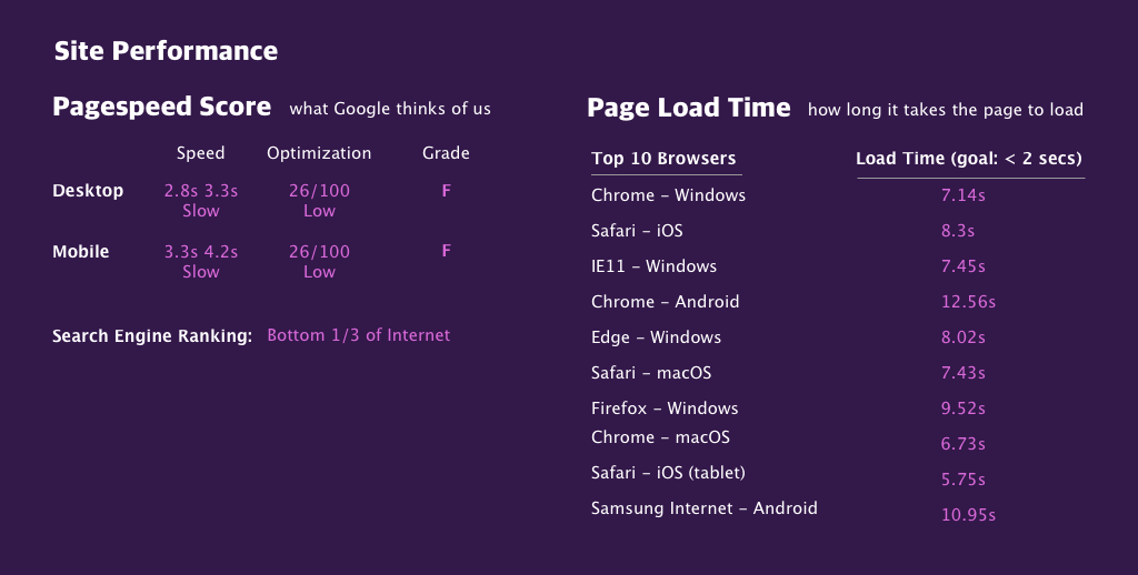
Site Performance Infographic
List of Suggested Site Optimizations from Google
- Enable Compression
- Optimize Images
- Eliminate render-blocking Javascript and CSS in above-the-fold content
- Leverage Browser Caching
- Minify CSS
- Minify Javascript
- Reduce Server Response Time
See list of site optimizations. Mark when these optimizations go into effect to compare if it helps increase the bounce rate for visitors. Follow Google’s SEO best practices guidelines. With the user’s session time being shorter than the load time, there is a possibility visitors are not waiting for the page to load.